Jatango Signup Experience
Creating an easy and straightforward registration and onboarding process
May - July 2024
Click anywhere to exit
Improving First Contact
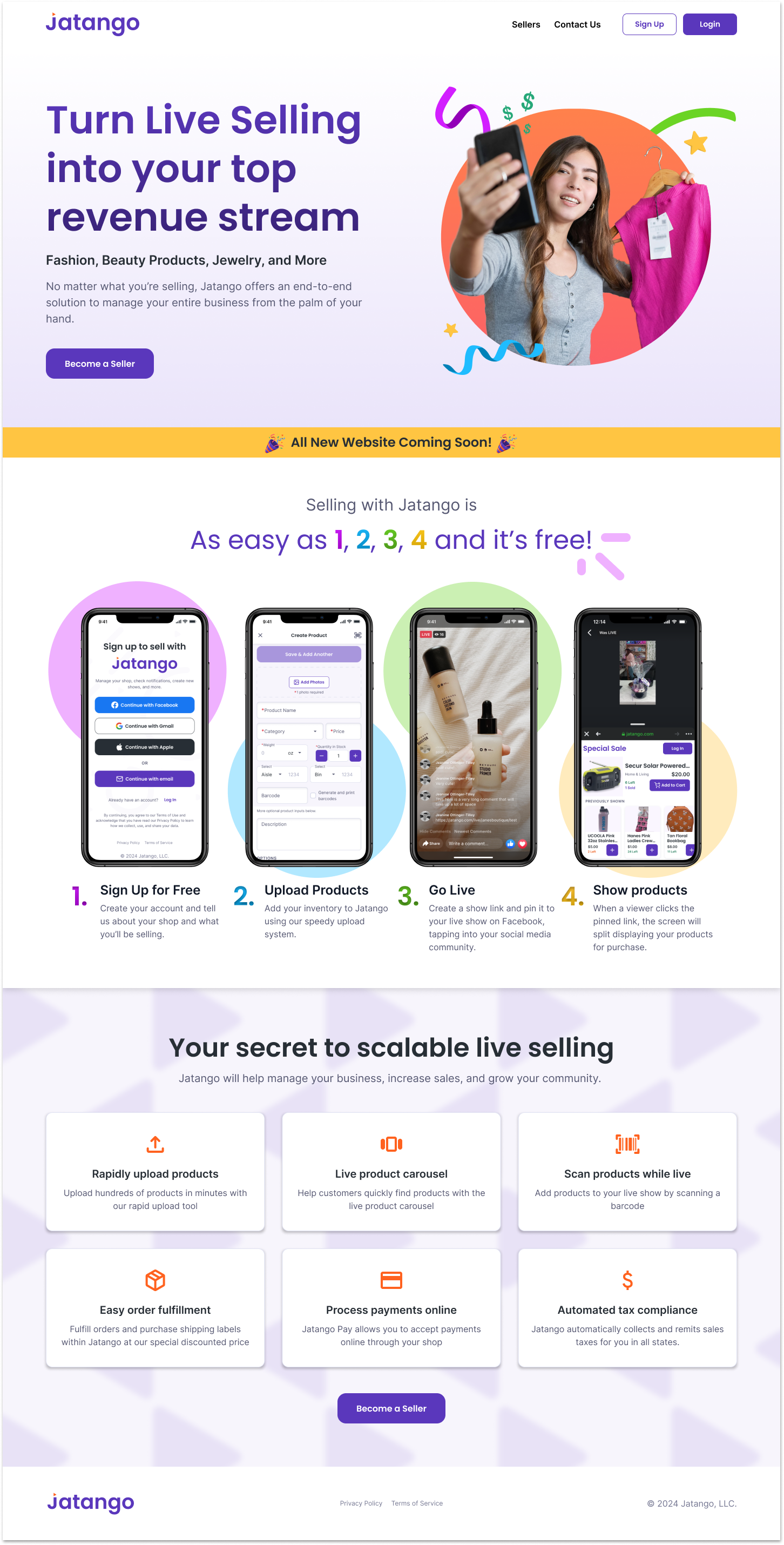
Jatango is an early-stage tech startup building a live-selling multi-vendor marketplace that makes buying or selling products via live stream easy. At the time of this project, Jatango was in alpha, with the design and development of the beta underway. My role at Jatango was Lead Product Designer. I worked closely with the C-suite to shape the design of the overall product experience as we worked towards moving Jatango into beta. This project showcases my process for designing the registration and onboarding flow used by Jatango today.
Purpose
For the alpha, Jatango used a basic account creation process for new users and a store creation process assisted by a Jatango employee for new sellers. Our goal in this project was to replace this with a fully fleshed-out registration and onboarding process that would streamline the process and provide a better experience for both buyers and sellers on the platform.
Requirements
To be successful, some of the requirements we had to satisfy included:
- Collect all necessary data for creating a user and store
- Collect behavior and demographic details about the buyer and sellers
- Collect tax information from sellers
- Verify both text and email address
- Make the workflow as concise as possible
- Provide "little wins" throughout the process
Discover
Research on Best Practices
To get started, I first researched best practices for a registration and onboarding experience. I wanted to determine what makes an easy and enjoyable signup experience and what design choices hinder or ruin that experience. To do this, I read through several articles from a variety of trusted sources, such as the Nielsen Norman Group, Interaction Design Foundation, and UX Collective, until I managed to form a solid list:
- Make login & registration optional
- Explain the benefits of registration
- Offer alternative methods for registration & login
- Minimize the amount of information you ask for
- Let users see their password
- Avoid repeating fields
- Avoid asking users to confirm registration through email
- Visually differentiate login and registration
- Provide support, guidance, and reassurance
- Keep users signed in when they register
Competitive Analysis
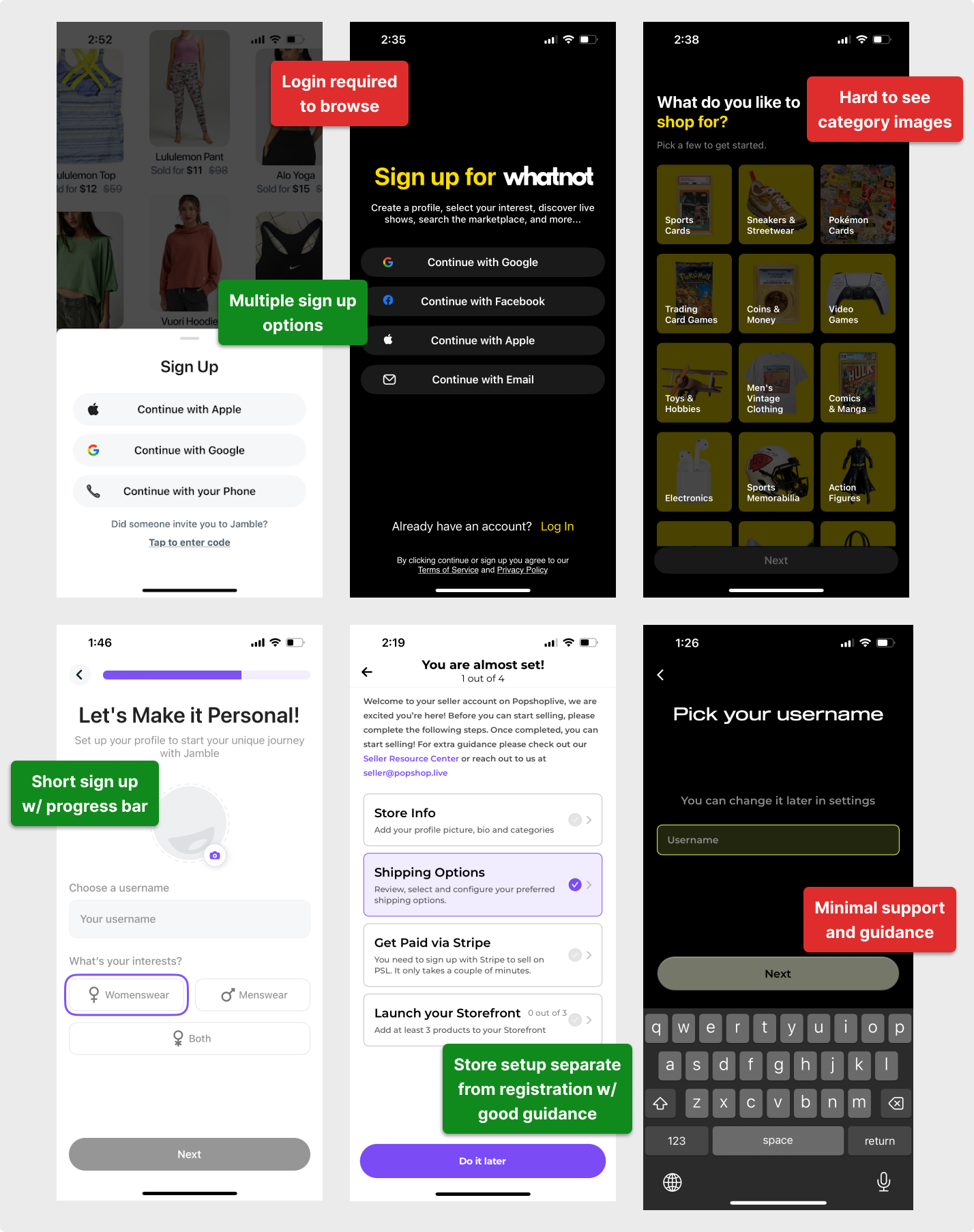
Next, I dove into assessing Jatango's main competitors, including WhatNot, Jamble, CommentSold, PopShopLive, and TikTok Shop, to see how they collect information from their users. This is my first time creating a multi-vendor marketplace, so I faced a lot of unknowns while working on this and other portions of Jatango. Looking at the competitors was always a solid place to start.
In addition to identifying information we likely should collect, I used the best practices I had established to conduct an informal heuristic evaluation, identifying what design choices our competitors made that we should likely avoid.
Define
Specifying Inputs
With this background information, I moved on to synthesizing this info into actionable insights. I refined the project requirements by distilling "necessary data," "behavior and demographic details," and "tax information" into a list of specific inputs we'd need to collect from users. Some of these inputs had to be collected for legal and security purposes. Therefore, we would prioritize it, while other details were information Jatango wanted to be collected from a business perspective.

The Basics
Information necessary to create and identify a user and their shop
- First & Last Name
- Password
- Phone Number
- Store Name

The Necessities
Information we needed for legal and security purposes
- Tax Address
- Last four digits of SSN
- Or Business EIN
- Birthday
- Zip Code

Nice to Have's
Information the business would benefit from having
- Seller Type
- Ship From Address
- Credit Card Info
- Billing address
- Contact Phone Number & Email
- Product Category preferences
- Average Revenue
Seller vs. Buyer Experience
Jatango is built on the philosophy that anyone can buy and anyone can sell; however, as with any e-commerce site, buying something has a much lower barrier to entry than selling. Thus, we decided everyone who creates an account on Jatango is a buyer by default. Anyone can then select to become a seller by providing additional information or save time by becoming a seller as part of account creation. Therefore, we had to plan for the experience of a buyer (who may later become a seller) and of a seller.

Develop
User Flow
As a first step in the ideation process, I began mapping out the user flow for the entire experience for both buyers and sellers. To do this, I ran down the list of information we needed to collect and began grouping information into screens and ordering screens by relevance.
I used the flow to identify inputs the user would provide and backend actions required, like emailing a verification link. The flow also helped me think through error mitigation for edge cases, such as users exiting Jatango mid-flow and returning later. This process provided a clear picture of what screens and actions would make up the experience.

Screen Building
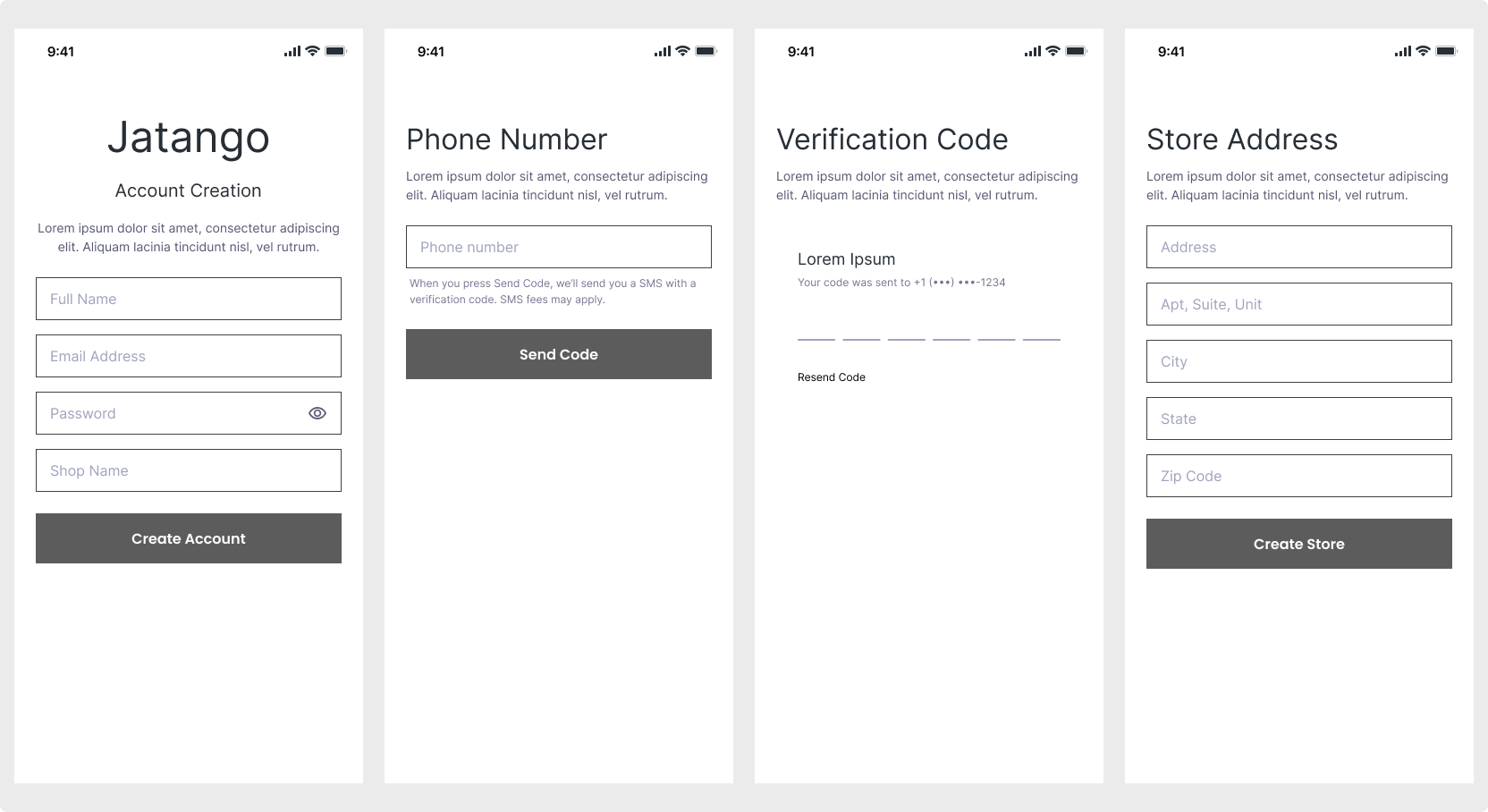
With a clear picture in mind, I dove into assembling screens for the flow, initially with sketches, then in Figma as lower fidelity screens. Since most users will access Jatango via a mobile device, I did all this from a mobile-first design approach.
As I ideated, I gradually componentized repeated elements throughout the flow to make the design consistent. I went back and forth between the user flow and the screens, updating the user flow as an issue or idea arose while also using the flow as a guide for the screens until we had the full flow mocked up.
Redefine Requirements
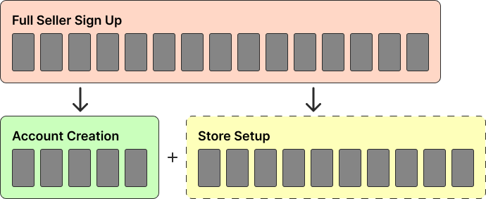
As I mocked up the screens and reviewed the flow with the business, some internal discussions led us to reevaluate some of our previous requirements. Specifically, for the seller signup experience, the business wanted the user to provide all their store information while creating their account, creating one long registration process. However, we determined we could slim down the process of creating the account and the store and then collect store details separately. Thus, we'd get sellers in the door without overwhelming them with a long list of questions.
Deliver
Prototype
With our ultimate design, we made account creation as brief as possible to get users in the door. This provided buyers and sellers with an identical experience apart from two additional steps for the seller to create a store. From there, both user types have access to their account and are free to start exploring Jatango. Then, for the seller, there is a phase of onboarding called store setup to collect more information about the seller and add more detail to their store.
Adding Flair
Unfortunately, the store setup process is a little long, so to break it up and create "little wins," we separated it into three sections: Store Details, Financial Setup, and Seller Profile. At the start of each phase, we put a progress screen to communicate what part of the process they're on, and I created animations for each phase to bring some life to the page. Additionally, to communicate the user's progress throughout the setup, I add progress bars for each section to give the user a clear idea of how many more screens remain before they finish the section.
User Validation
Throughout the design process, we received validation on different design elements from our alpha users. For instance, we collect the user's shopping preferences for product categories using tiles with images depicting the categories. We used our alpha users to select photos that effectively represent each product category.
We also conducted A/B testing for different screen layouts and ordering. We used the prototype for overall usability testing with our alpha users by assessing their ability to progress through the workflow. Through this validation process, we identified areas that caused confusion and improved the overall experience before beginning development.

Conclusion
Though the project sounded fairly linear the way I outlined it above, we did undergo a couple of iterations of defining the project requirements, working on the screens, and then redefining the requirements. In my time working at Jatango, I had an ongoing struggle trying to get definite requirements from the C-suite. The business consistently changed requirements mid-design(and sometimes mid-development), so re-designing for new requirements was a common theme. That said, for this project, some of the business's requirement changes were for the better. For instance, initially, the business wanted to require verification for both email and phone number before allowing the user to log in, thus creating a hard stop from allowing the user to explore Jatango without verification, likely leading to a higher drop-off rate.
Ultimately, though the whole flow is a little too long for sellers, I designed the experience to be as efficient as possible while still collecting all the required information. Time will tell if pain points arise that require this process to be streamlined further.

 Home
Home
