Southern Glazers' CRM Design Library
Auditing then defining design standard across a CRM
April - July 2023
Click anywhere to exit
Creating Cohesion
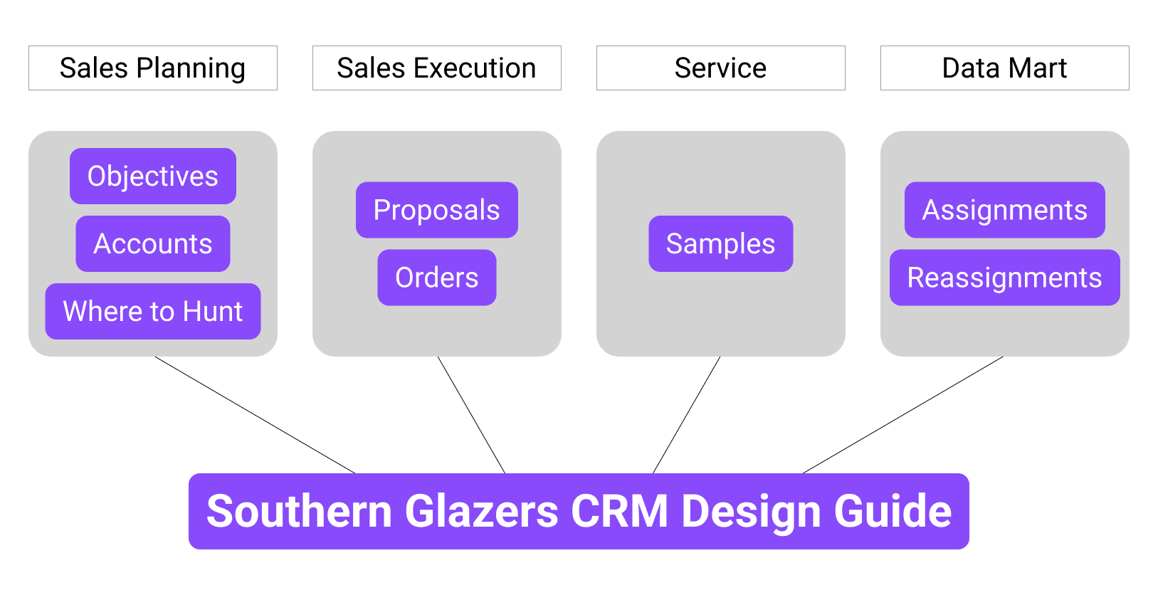
Southern Glazer's (SG) is the largest wine and spirits distributor in the US. To manage their wide range of clients in 44 states, SG sales consultants use a CRM platform built from Salesforce that consists of four distinct product areas: Sales Planning, Sales Execution, Service, and Data Mart. Each product area is run by a product owner(PO) with their own development team. As each area has grown, there has been a gradual deviation in design style, leading to a lack of cohesion.
For anyone unfamiliar with Salesforce, it can be used in two ways to build a company's CRM: no-code, declarative construction within the Salesforce platform, or custom-build using tokens and specs from Salesforce developer libraries, which pull from their design system. The Salesforce Lighting Design System (SLDS) is fairly extensive and flexible, which can be beneficial, but also risky in a large organization since it can lead to inconsistencies in design across teams work independently. You can't use the SLDS in such a setting to inform day-to-day design decisions. To fix this, I worked as part of an external design team to spearhead an audit of SG's CRM and establish design standards for their future design work.
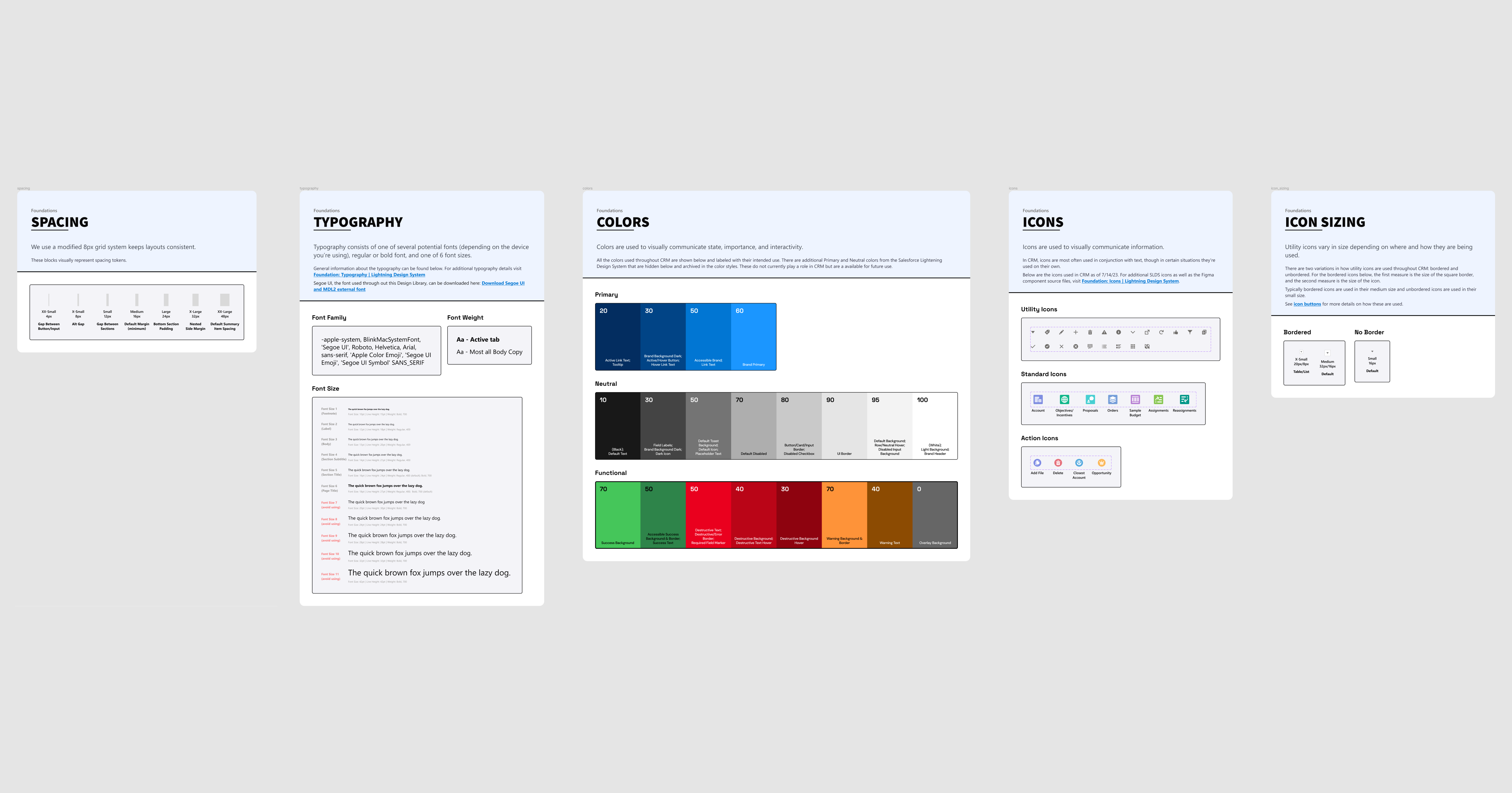
Southern Glazers' new CRM Design Library in Figma
Purpose
The aim of this project was to improve the user experience across SG's CRM by establishing a more cohesive design that allows sales consultants to operate more efficiently. To accomplish this, we first assessed the current design of all the major subareas of the CRM within their four product area. Then we identify inconsistencies in how UI features are used across these areas. And lastly, we used this information and best practices to create a design library that draws from the SLDS and expands upon it to suit SG's needs. The goal is for this primary deliverable to guide their design team's future work and provide their developers with a concise reference for building specific UI elements, which will help minimize design mistranslation.
Requirements
As part of this project's scope, we had to adhere to the following requirements:
- Assess all currently active areas of the CRM.
- Adhere to the SLDS as much as possible.
- Validate recommendations and design changes with all the POs and the primary client who oversees the POs.
Approach
This project consisted of four phases: CRM Mapping, UI Inventorying, Design Standardization, and Library Construction. Below are short summaries of each phase. Expand each phase's "Read More" section to dive deeper into specifics.
CRM Mapping
Phase Overview
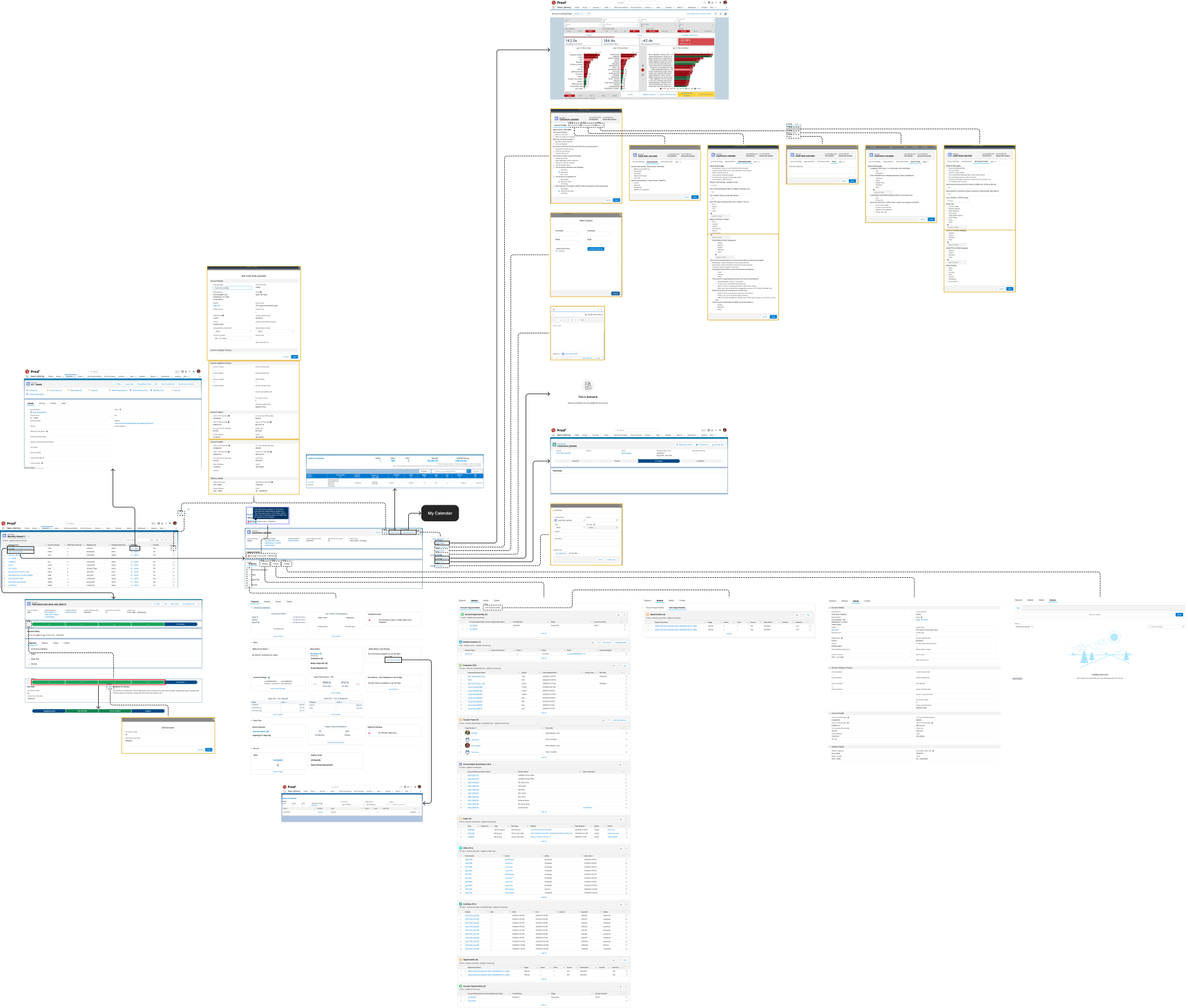
To kick this project off, we first broke down the current state of the CRM platform by auditing specific areas within each product area to create comprehensive flows. These flows were essentially maps that gave a clear overview of the UI, that we could then use to easily compare the design in different areas of the CRM.
Read More

Identifying Areas of Focus
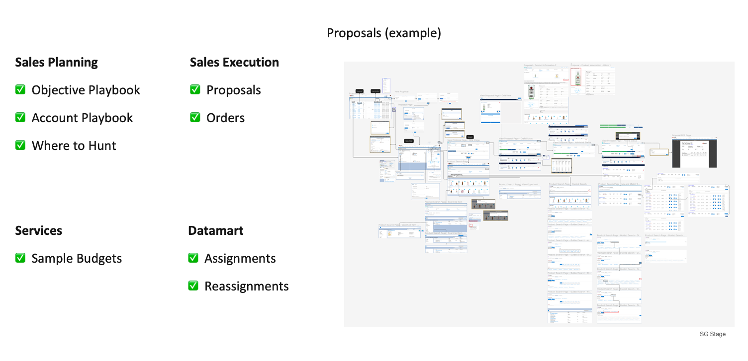
Before we could jump into auditing, we first needed to define the scope of the audit and determine what areas within the CRM we would assess. Through discussion with the client, we identified eight areas across the 4 product areas that were the most significant for us to focus on.
Mapping Subareas
With our focus areas determined, we mapped out all the screens and interactions in each area. To do this, we went into the CRM and navigated through workflows, during which we captured screenshots that we imported into Figma. We had to run through workflows and backtrack multiple times for many of these subareas to ensure we captured every unique screen and interaction. Once we had everything in Figma, we annotated all the screenshots, connecting screens with arrows to create extensive flows and calling out design observations.
UI Inventorying
Phase Overview
With the help of the audit flows, we began inventorying different UI features, such as buttons, input fields, modals, and more, in eight focus areas of the CRM. While cataloging features, we considered both their style and function to group them accurately.
Read More

UI Building Blocks
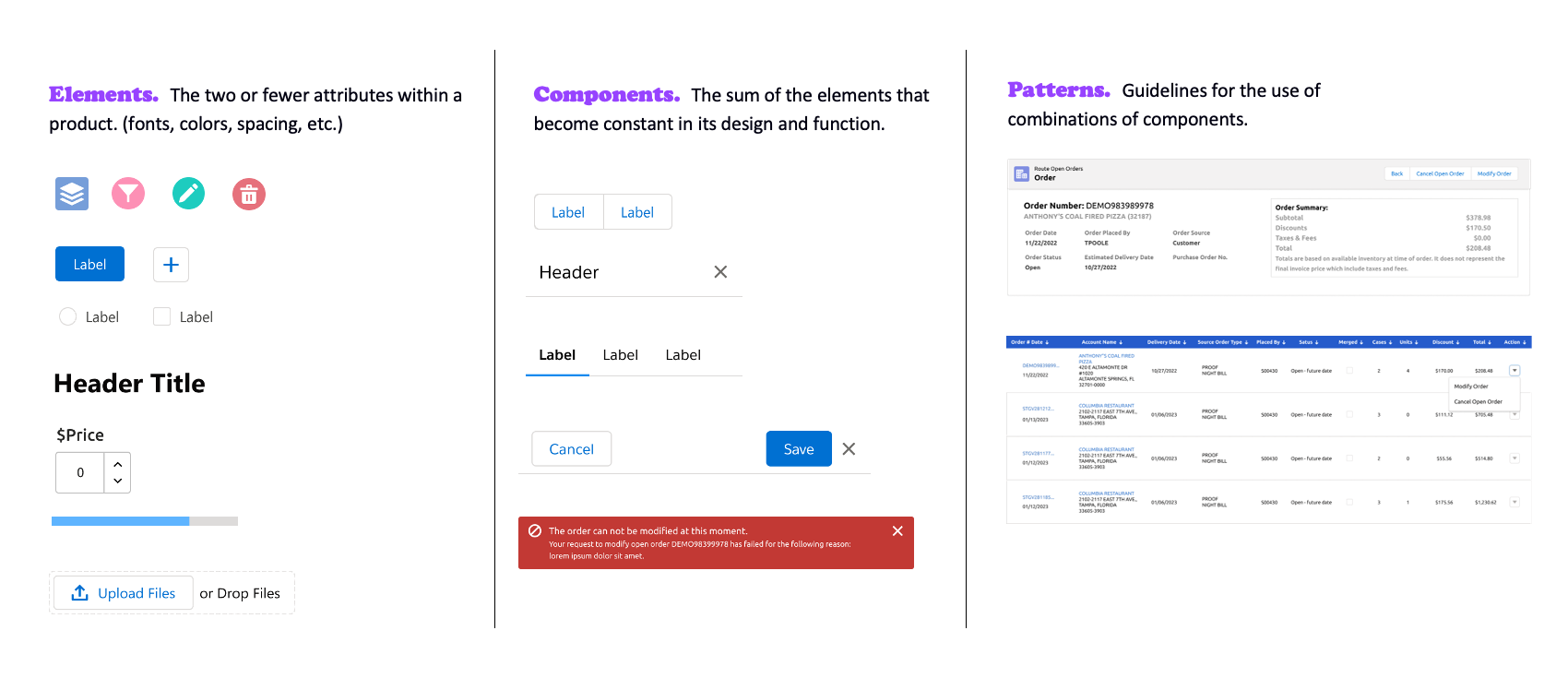
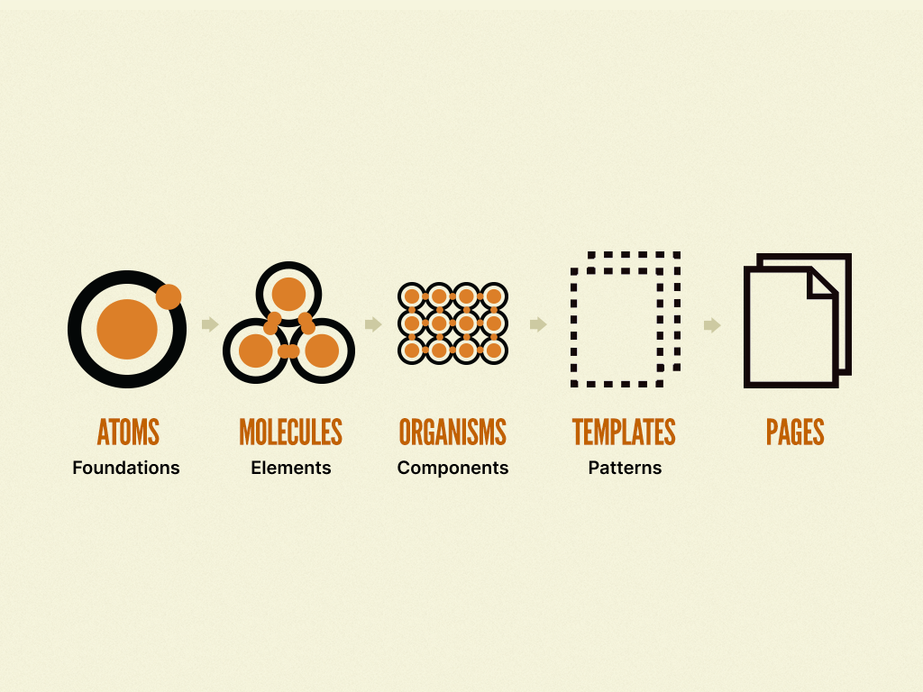
To conduct our audit, we chose to look at this project through the lens of atomic design, in which everything is made from atoms that combine to form molecules that combine to form organisms that combine to form templates that combine to form pages. For our purposes, we decided to refer to these categories as foundations(atoms), elements(molecules), components(organisms), and patterns(templates), leaving out pages. We then broke these down further into specific UI features within each category, such as buttons, inputs, and checkboxes for elements.
Inventory Creation
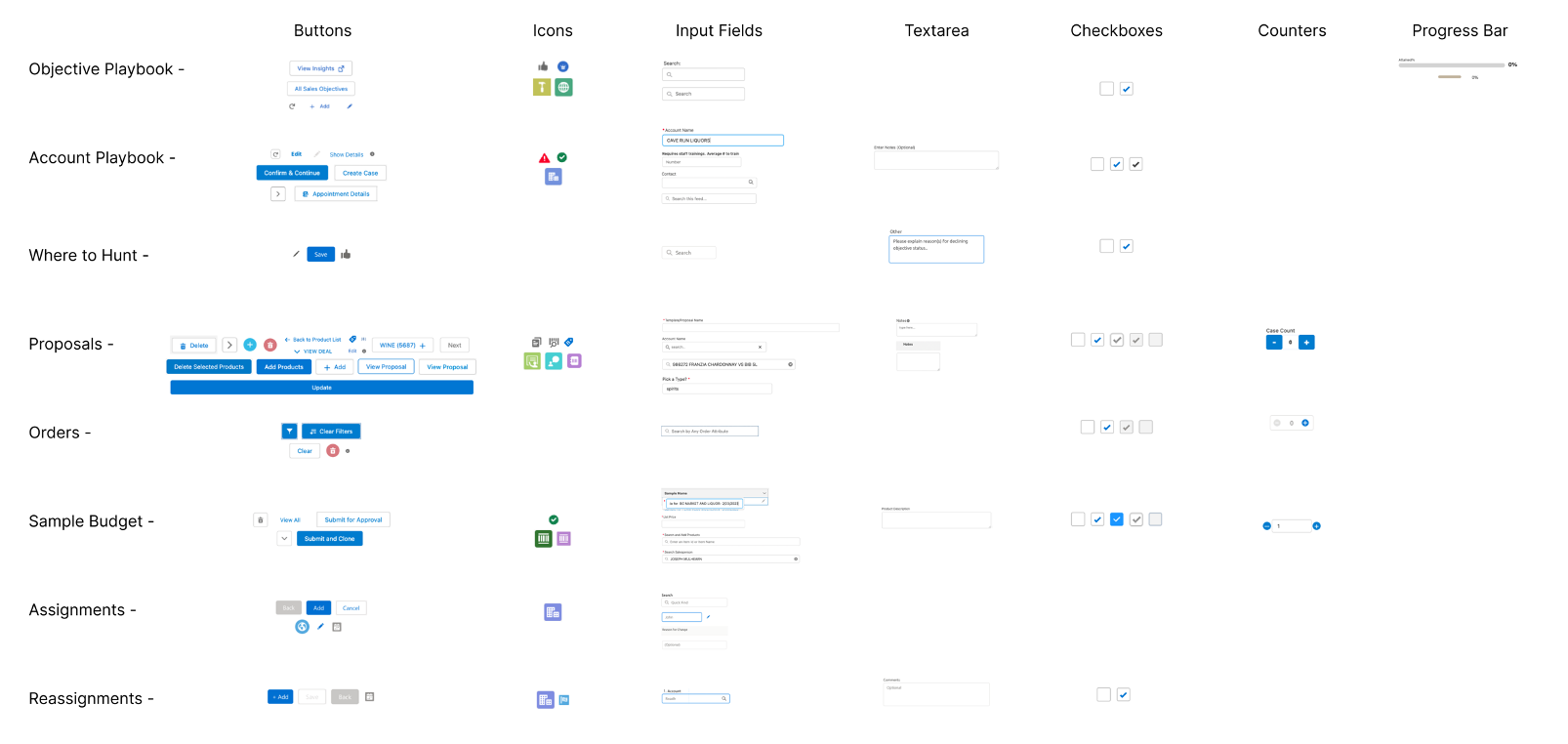
With specific UI features in mind, we created inventory matrices for each category with the eight areas along the side axis and the UI features along the top axis. We then reviewed the flows, collected examples, and filled the matrix with unique instances of each UI feature until we had inventories for each category.
Design Standardization
Phase Overview
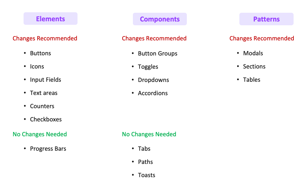
Using the inventories, we compared style and function of UI features across the eight areas and identified inconsistencies for nearly every type of feature. We then recommended how each inconsistency could be remedied and presented our findings to the client for discussion and validation.
Read More

Identifying Inconsistencies
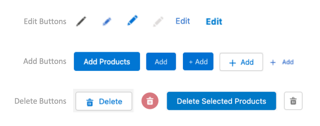
Comparing features between the eight areas, we cataloged all the examples in which specific features were styled differently but functioned the same or styled similarly but functioned differently. For example, we found six different styles of edit buttons that all had an edit function.
Creating Recommendations
With the inconsistencies identified, we then used the SLDS to determine if inconsistent UI features aligned with the design system and suggested remedies from the SLDS when they did not. Then for situations in which inconsistencies did follow the design system, we looked at the CRM experience as a whole and drew on UX best practices to craft recommendations that would simplify the design while still being flexible enough to work across all areas of the CRM.

Readout & Discussion
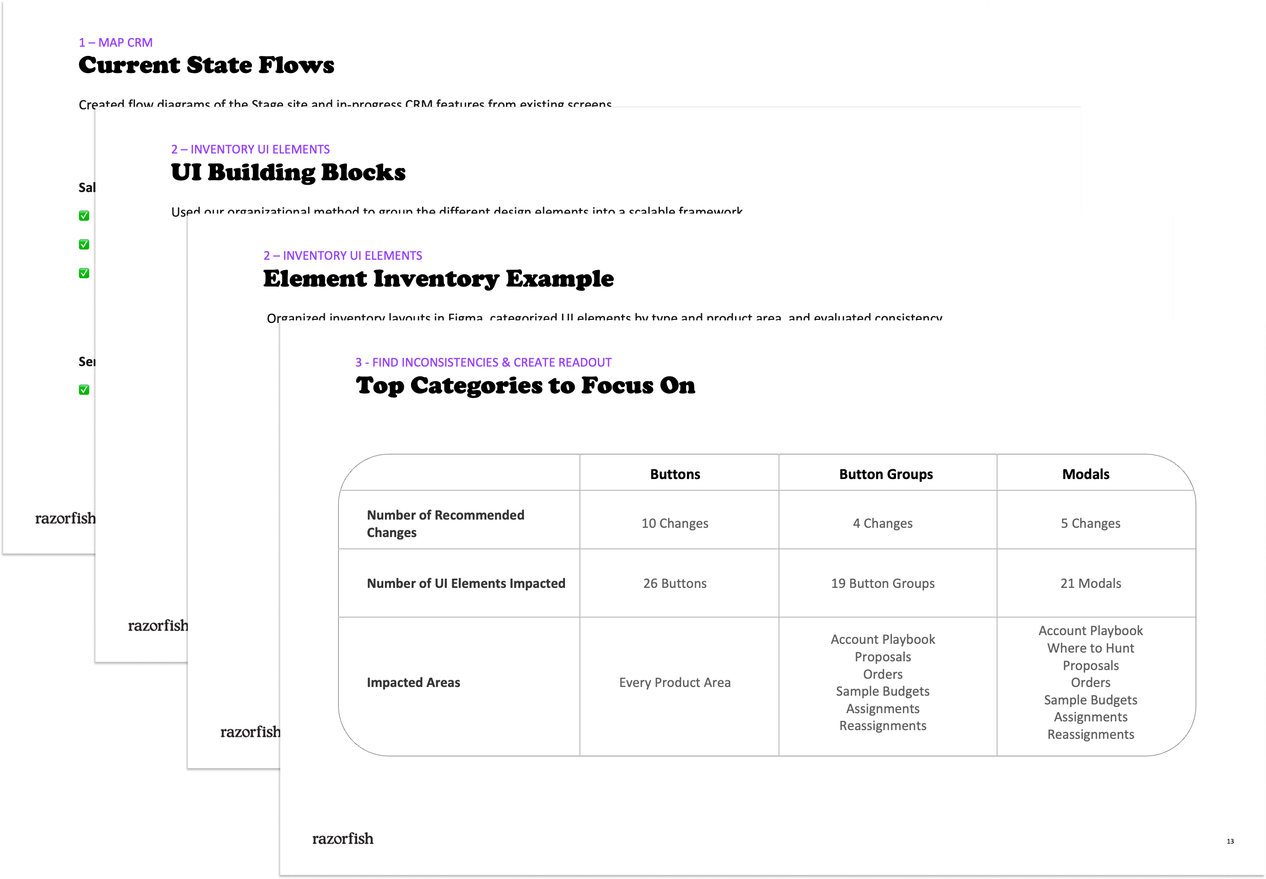
Following our analysis, we presented our findings to the client, reviewing each inventory and discussing our recommendations with all the POs. With their help, we amended some of the recommendations and reached a consensus on design standards that they could use to remediate inconsistencies and that we would use in the next phase of this project.
Library Construction
Phase Overview
Lastly, we synthesized a design library using the rough design standards we established from our readout and discussion. We built off the SLDS as a foundation, expanding upon designs in certain areas while pairing down UI features and variations in others to better suit SG's needs and define a more coherent design ecosystem. We ultimately created guides that will greatly benefit both their design and development teams going forward.
Read More

Figma Design Library
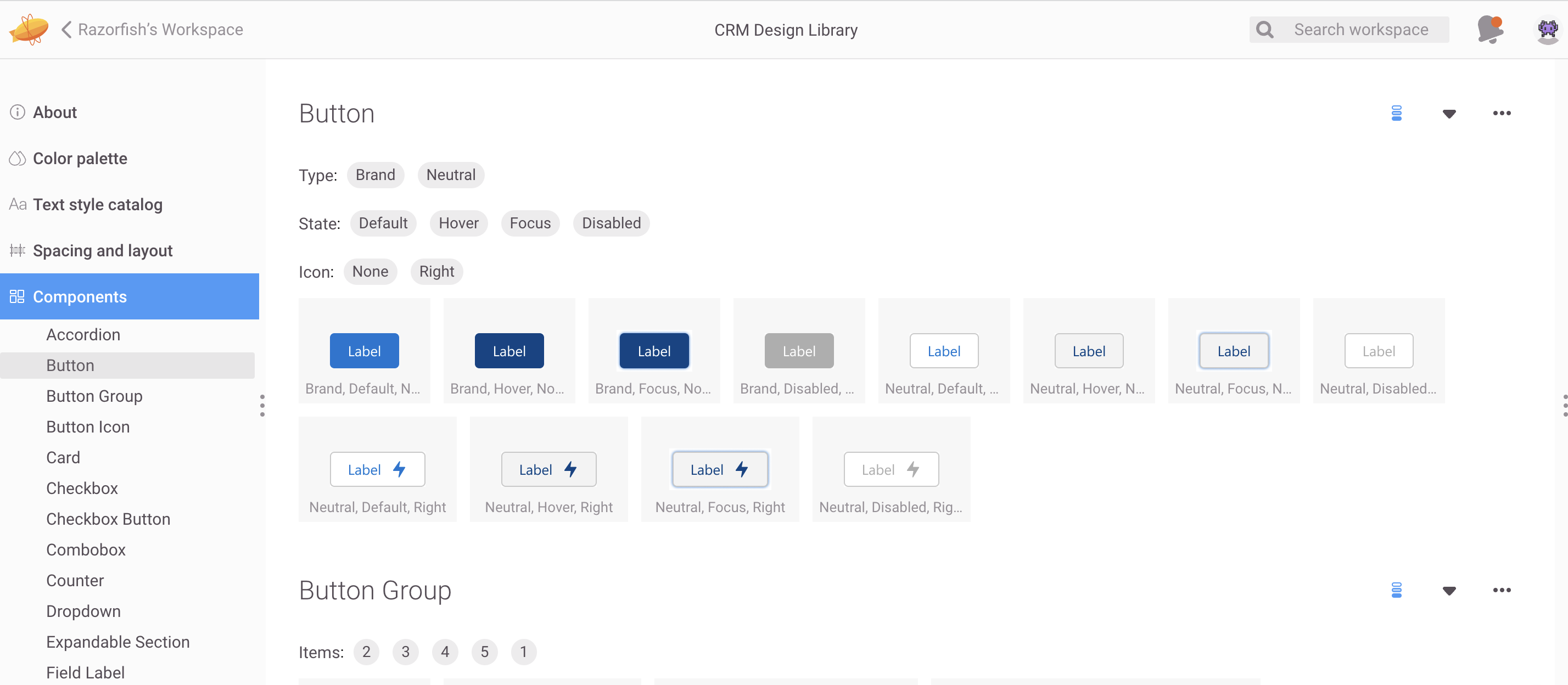
The library we created consisted of pages for each atomic design category: foundations, elements, components, and patterns. The foundations page outlined design tokens like spacing, font, color, and icons, which were captured in Figma styles and components when possible.
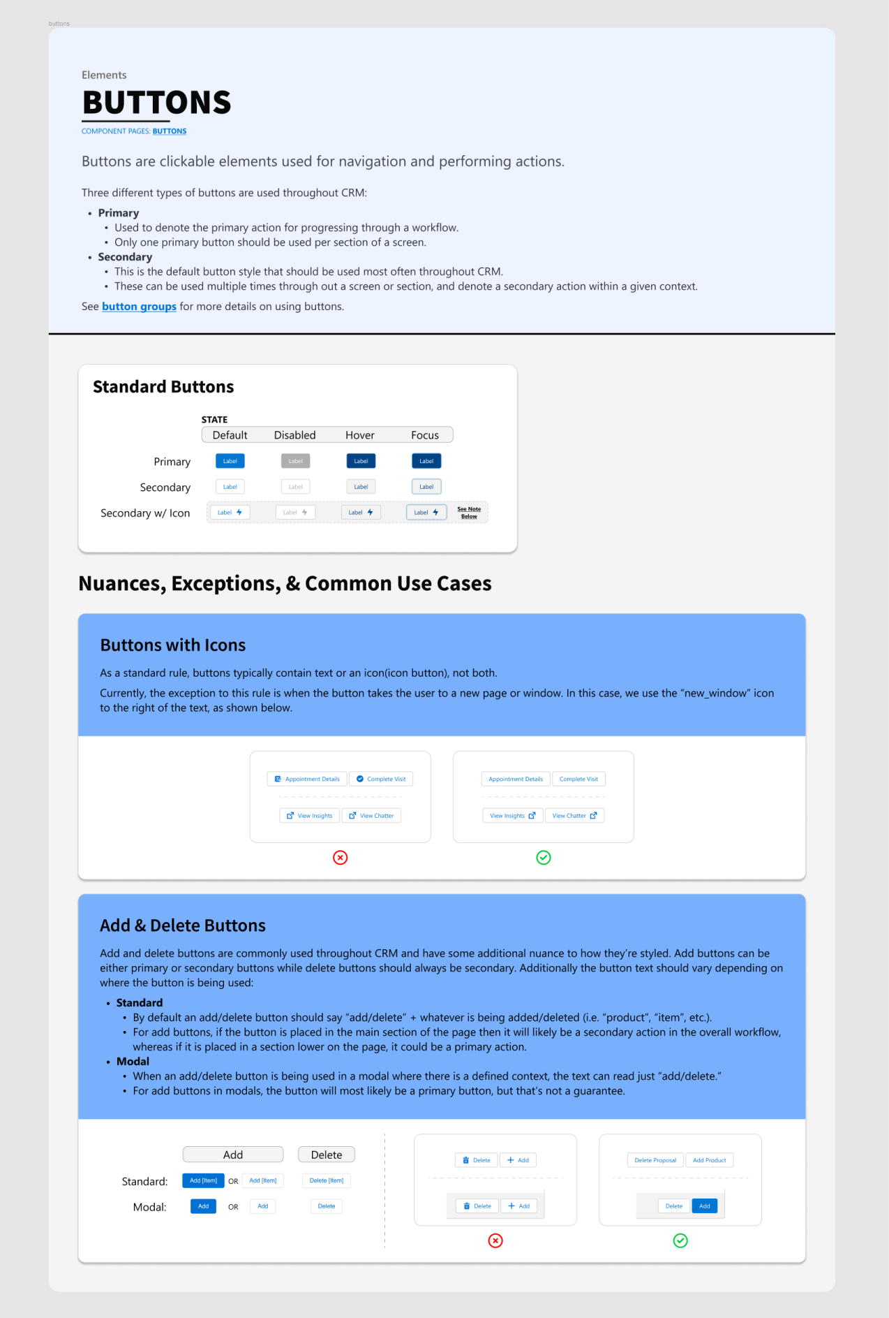
The other three pages had different sections for each UI feature we assessed in the audit. We defined each feature's role, listed general information about its function and styling, and outlined its standard design variations and states, which were also captured in Figma components. Then, for many of the features, we provided additional documentation on specific use cases, nuances, and exceptions to the standard instance of that feature. Lastly, we published all the Figma components and styles to a library so that other design files could access them.
Zeplin Style Guide
At SG, all design work is handed off to developers via Zeplin. Thus, as a counterpart to the Figma Library, which is meant for the design team, we configured a Zeplin style guide for the development team. This style guide provides precise design specs for UI elements that developers can reference, and it gives them a repository to pull from when they're inevitably making last-minute additions without the design team's input.
Conclusion
This project really came together, and I'm proud of the result. It was a lot of work to sift through all the inconsistencies across the four teams and then piece together a coherent and consistent design system, but it was also very engaging and interesting. My team and I have started moving on to other projects as a new design team from Southern Glazers has taken over. This document has proven to be very helpful in getting them up to speed and providing them with a solid foundation to start their work.
Creating a design system was a big project for me, but it was also a great chance for personal growth. I developed a methodology for building a library from an existing design ecosystem and for configured a Figma Library file to be practical and efficient for everyday use. Overall, I consider this project a successful endeavor.

 Home
Home