Norridge Jewelers Website
Jewelry with a personal touch
August 2021 - January 2022
Click anywhere to exit
A Much-Needed Facelift
Norridge Jewelers in Norridge, IL, is a family-owned jewelry store that has been in business for over 45 years. In those 45 years, they've made a name for themselves in the Chicago land area and built a solid base of loyal customers. However, Norridge Jewelers is in constant competition with large jewelry store chains with superior supply infrastructure, up-to-date websites, and online POS, as well as other family-owned jewelry stores in the area. To stay relevant and competitive with these other businesses, keeping current with their technology and leaning into what makes their service unique it's vital for Norridge Jewelers.
I took Norridge Jewelers on as a client to give a much-needed facelift to their previous website, which they had not updated in 15 years. On top of this, a major focus of the redesign was to better utilize their website as a marketing tool to stress what makes Norridge Jewelers one of a kind.
- Project Role: Web Designer and Developer
- Product Type: Responsive Website
- Product Type: octopus.do, Adobe Illustrator, Adobe XD, Webflow
Discovery
Discovery Call
We started the project with a discovery call to gain insight into Norridge Jewelers as a company. The goal of this call was to get to know the company better by asking about matters such as, who their clientele are, how they attract new customers, how often they update information on their website, and what their expectations were for the project. Using this information, I could set expectations on what support and knowledge I would need from them and outline a realistic scope and timeline for the project.
Discovery Call
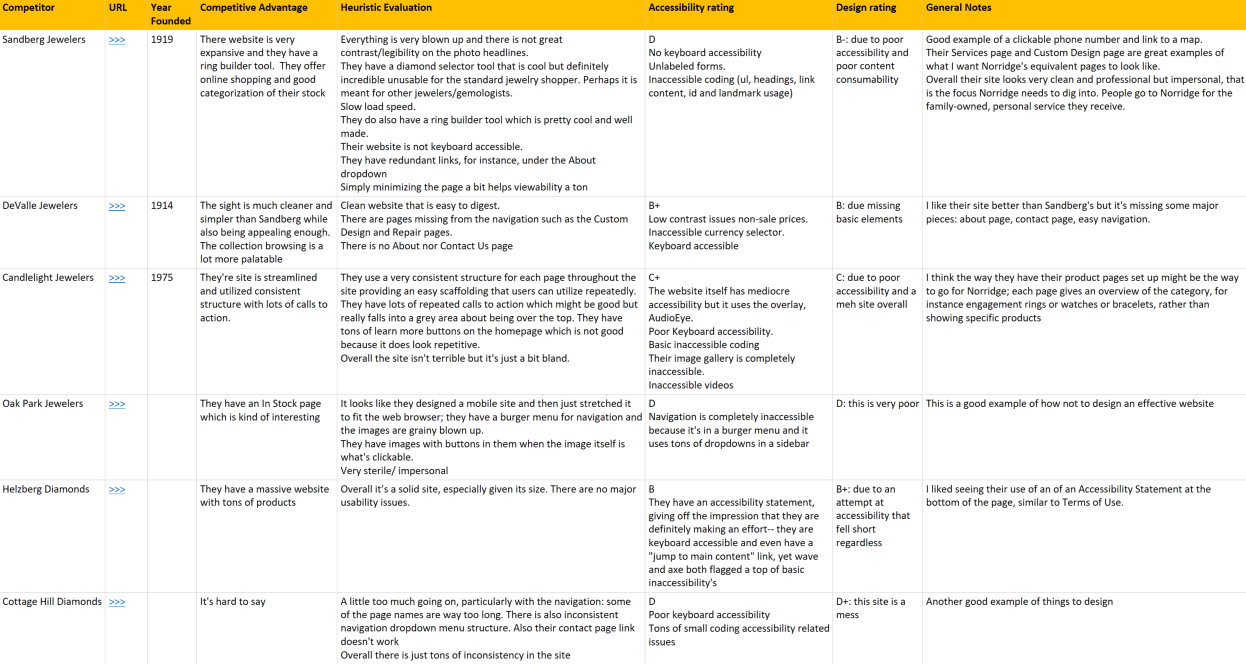
During the discovery call, I also asked who some of their competitors are. Using the names they gave me and some other jewelry stores I found in the area, I made a list of competitors and conducted a competitor analysis. In this analysis, I did individual heuristic evaluations of the other jewelry stores to determine what they were doing well, what they were doing poorly, and what areas of opportunity there were for Norridge
Some common issues I saw from competitors were the following:
- Sites were very impersonal
- Designs failed to provide basic accessibility
- Pages were too cluttered with information
From this analysis, some takeaways I had for the new design were:
- Aim for a simpler site that's not over-cluttered and has clearly defined sections
- Provide more information about custom design work and ancillary services
- Make Norridge's site more personal and human by stressing that the business is family-owned and operated

Ideation
Sketches
After gaining insights from the competitive analysis and determining areas of opportunity, I had general ideas for the design and site content that I began to flesh out by putting pen to paper and sketching rough layouts.

Visual Sitemap
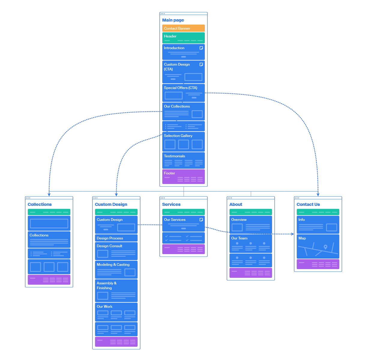
Alongside the sketching, to get a visual overview of what pages I would include in the website, I used octopus.io to create a visual site map that displayed each page and the various sections for each page. This site map and the finer detail captured in sketches gave me a solid visualization of what I wanted the design to look like and how I wanted to present information on the site.
Mood Board
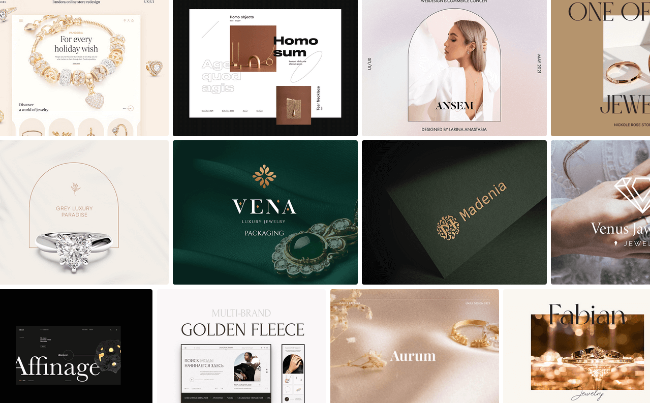
To give the website a more modern feel, I revamped its styling and structure. I created a mood board to capture the same clean elegance commonly associated with jewelry and fashion and a friendly, familial vibe, a major selling point for Norridge Jewelers.

Prototyping
Lo-fi Prototype
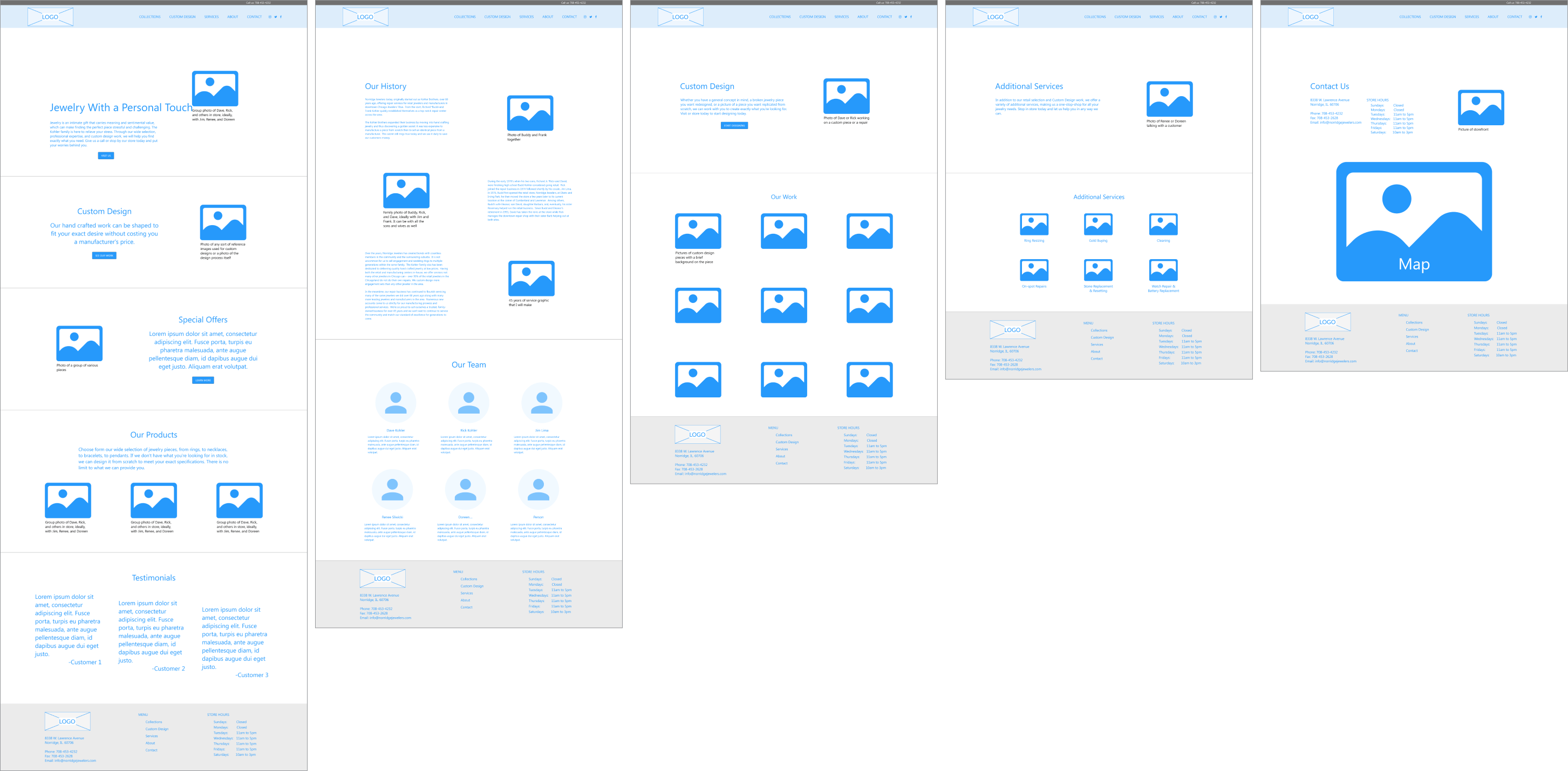
To kick off creating the website, I first made a lo-fi prototype that was a step above a wireframe. Creating this prototype was fairly straightforward, as it simply involved using Adobe XD to combine the overall structure from the visual site map with some of the finer details of sketches. Styling was intentionally left out to focus solely on the website's structure and how pages connected.

Hi-fi Prototype
Next, I used the lo-fi prototype as a skeleton, adding styling and functionality to turn the prototype into a hi-fi prototype. The mood board inspired the styling I had created while pulling colors from the store's logo. Additionally, font sizes, color choices, and layout was all chosen with making an accessible experience in mind.
Development
Build in Webflow
Last but not least, I built the website in Webflow. This project phase was also relatively straightforward, translating the design into a functioning site. I chose to use Webflow instead of coding from scratch to speed up the development process and better support the future addition of an online POS, which would require a CMS.
During development, I made subtle changes to the design, such as with the interaction design, since there are limitations to the interactions you can create in Adobe XD. But for the most part, the website build stayed true to the UI in the prototype. Check out the full site here: http://norridgejewelers.com/
Conclusion
This new site will increase pull to the store, particularly appealing to younger consumers who are more likely to utilize the website and more readily stake their judgment of Norridge Jewelers as a business based on the look and feel of their website. I am still gaining hard data on the exact stats, but initial Google Analytics shows a positive flow of site visits and average engagement time. From this alone, I am comfortable deeming this project a success with additional future potential.
One element common to retail businesses' online presence nowadays is an online store. Creating an eCommerce experience was outside this project's scope but is something Norridge Jewelers is interested in adding down the line once they have more of an infrastructure to support it.

 Home
Home