Sidebar Virtual Meetings
Video conferencing reimagined around social communication
September - December 2019
Click anywhere to exit
What is Sidebar?
While video calling offers a workable alternative to in-person meetings, it lacks many nuances and flexibilities of face-to-face interactions that facilitate fluid communication. By focusing more on accommodating social behaviors common to in-person interactions, we can bypass video call limitations and make communication more natural and intuitive!
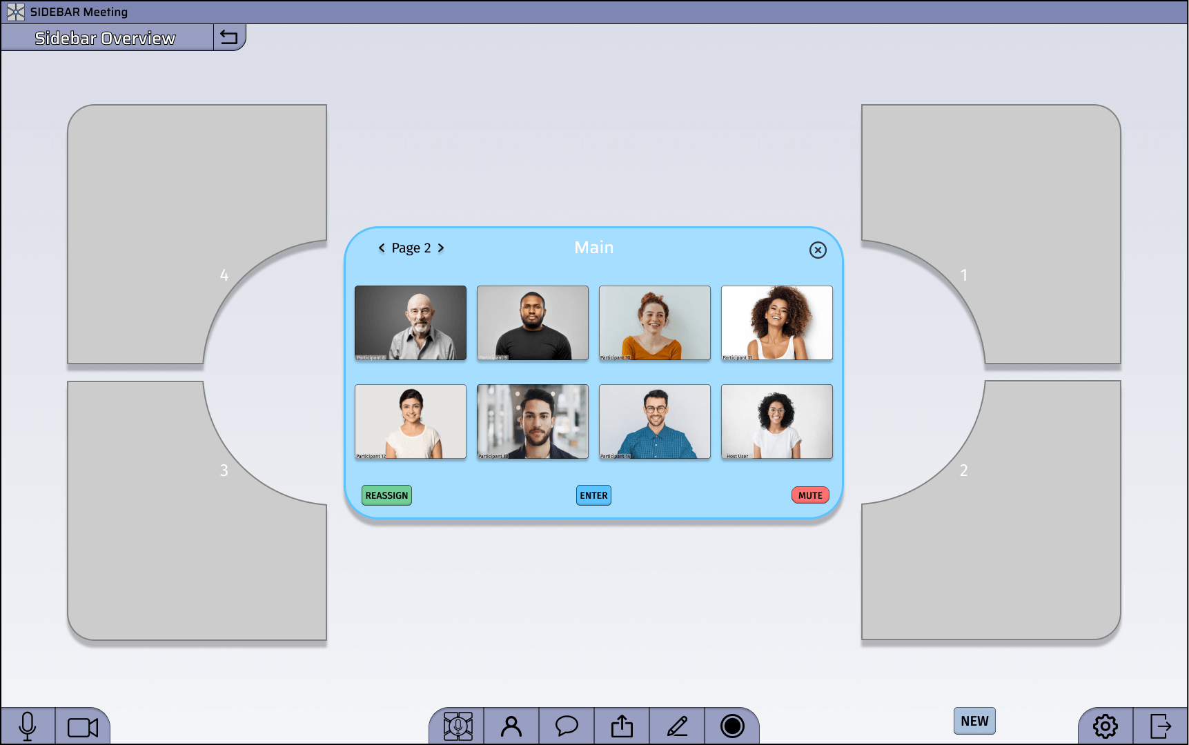
I set out to redesign the standard video-call experience using a two-dimensional environment in which sidebar conversations can easily break off from the main conversation. This navigational concept and other improvements involving audio modulation and general usability changes provide an experience better adapted for standard social behavior and benefit all video call users.
I worked independently on this design project for about 2.5 months. I relied on friends' and family's help to provide user feedback and testing.
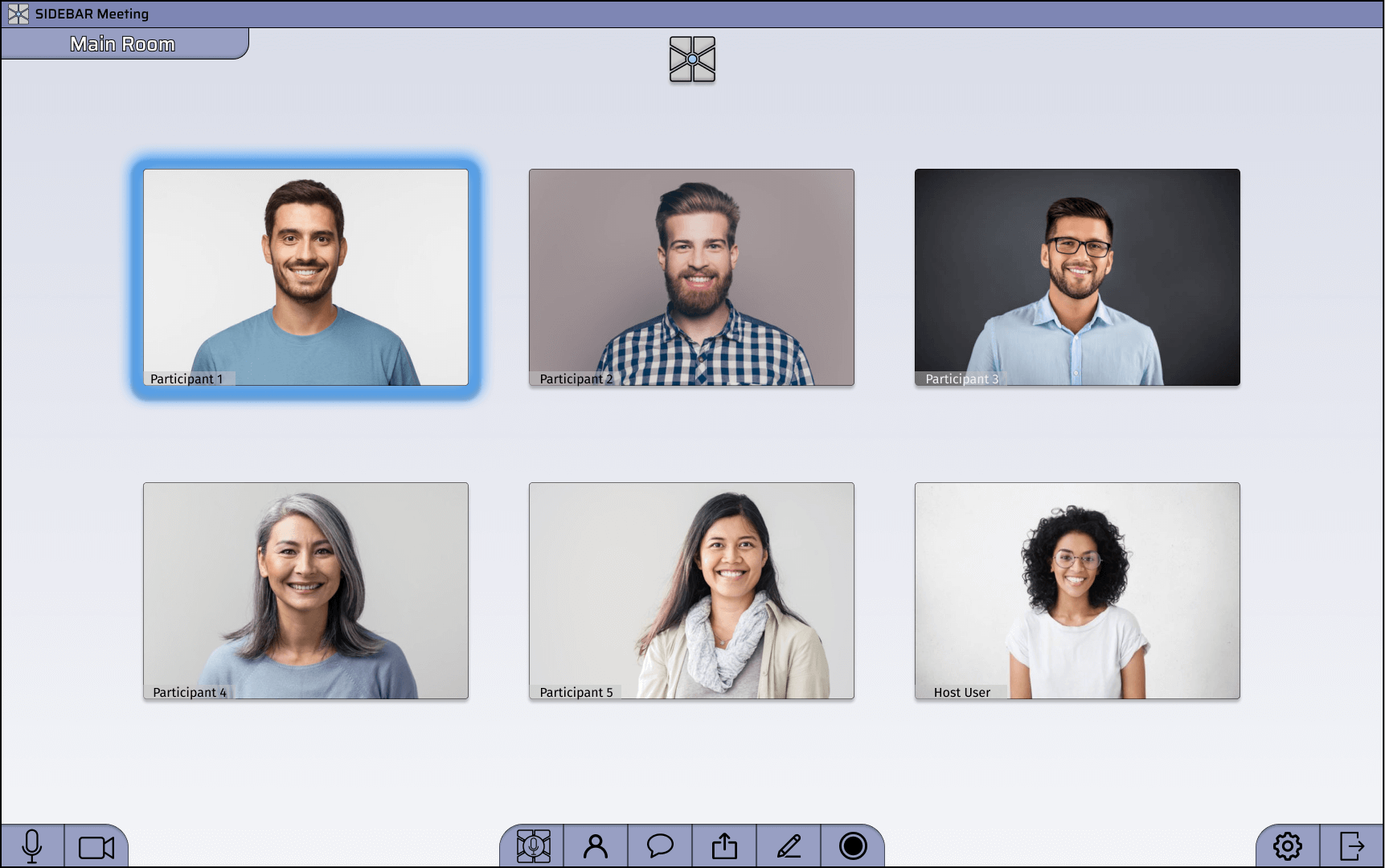
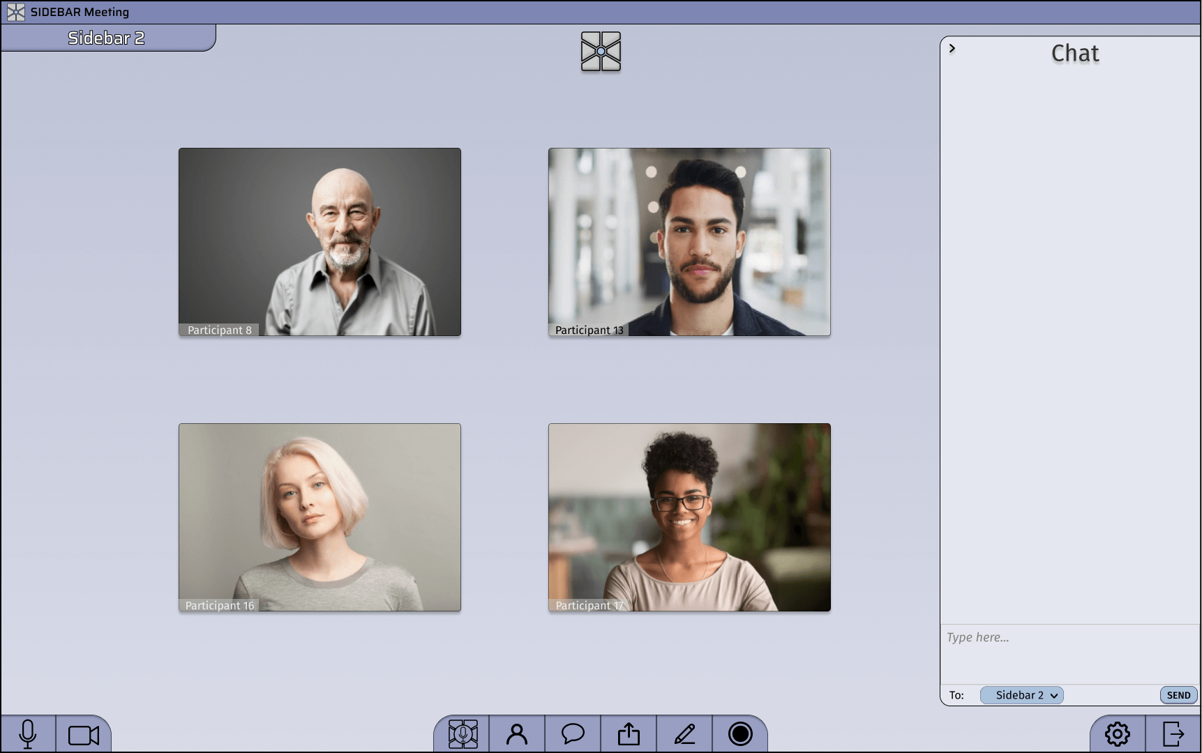
This is Sidebar!
User Interviews
To begin the process of understanding and empathizing with my user base, I interviewed five individuals from various professional backgrounds, each with slightly different relationships with video conferencing. I wanted to understand how they use video calls daily and what issues they commonly encounter.
From these interviews, I could identify three common pain points shared by each user.
"The problem is that when you're in a conference room or in a room you can have multiple conversations going at once. When you're on a Zoom, you can't. So people are always interrupting each other and it's hard to hear."
- Sara, Director of Operations and Finance
"More control to more people would be helpful [when on very large calls]."
- Frank, Social Activism Coordinator
"[Having more fluid rooms] solves the fundamental problem of when you're on a Zoom call you have to be on the Zoom call with everybody at once and whatever you say has to be relevant to everyone and worth everyone's time."
- Mike, Senior Bioinformatics Engineer
Pain Point 1:
You can't easily have side conversations, so the whole call has to participate in one conversation at a time.
- This limitation creates higher expectations about when talking is acceptable because whatever you say has to be relevant and worth everyone's time.
- Interjections, comments, or jokes are often disruptive on video calls despite being normal and productive to face-to-face interactions.
Pain Point 2:
Holding people accountable and engaged is difficult when people can turn their cameras off or discretely multitask while on a call.
- This anonymity makes it easy for people to get distracted while on a call, even when the conversation is important to them.
Pain Point 3:
It's tough to coordinate turn-taking and avoid talking over people or being talked over.
- This behavior leads some people to participate less to avoid the awkward situations these difficulties caused.
Point-of-View Problem Statement
Having established an understanding of my users and the struggles they face, I synthesized the following problem statement to help guide me through my design process:
As a result of the pandemic and distance from friends and family, individuals need an effective and safe way to communicate with co-workers and socialize with their loved ones to continue their work and satisfy basic human needs for human connection and positive relationships. Particularly in trying times such as these, people must stay in contact with one another and fulfill a desire to socialize and have fun without jeopardizing their mental and physical health.
Personas
To support continued empathy throughout my design, I used the information I gathered to define standard users I could look to when making design decisions. I created the follow two personas:
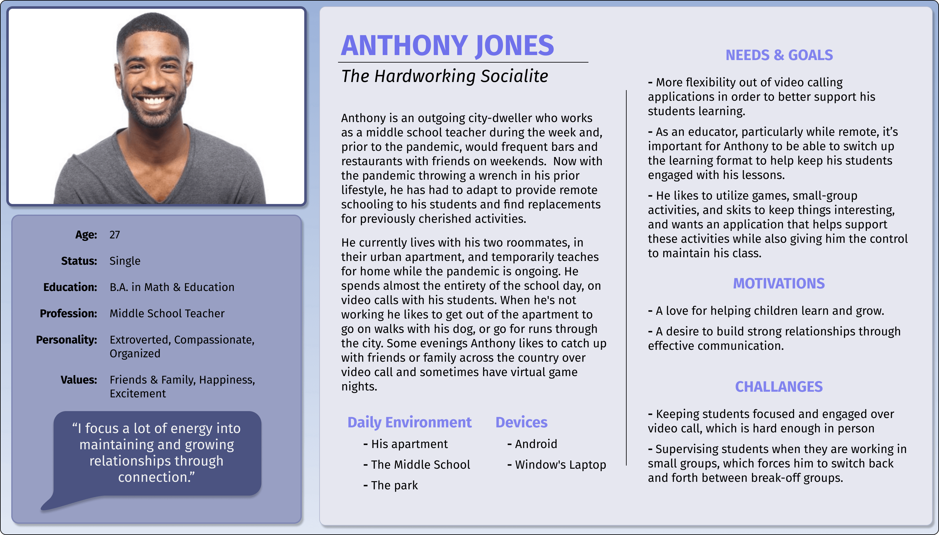
Say hello to Anthony, the hardworking socialite
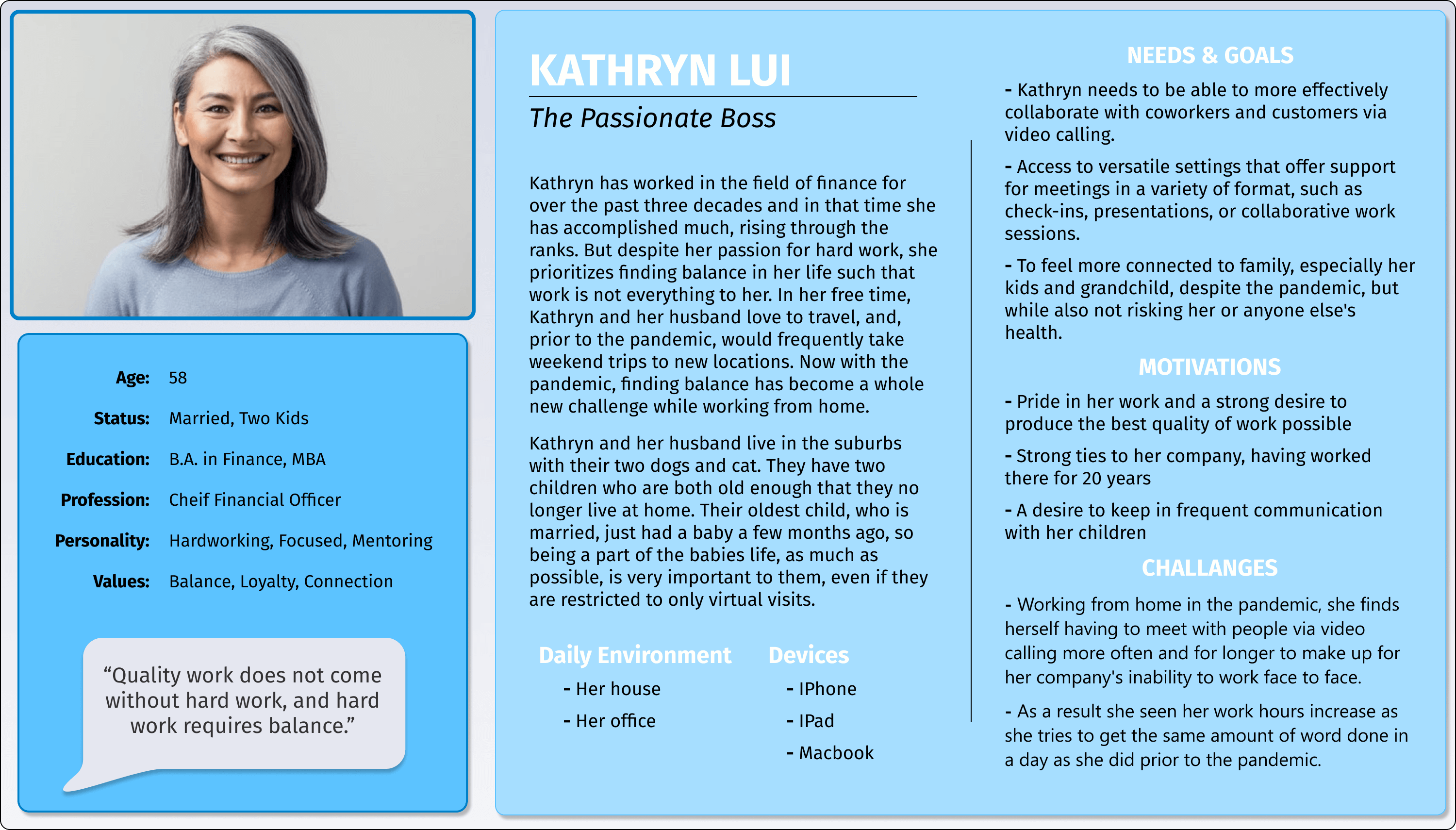
Meet Kathryn, the passionate boss
Braindump
With a solid understanding of the design problem and who my users are, I kicked off the ideation process with a brain dump. I listed as many ideas as possible based on the feedback I received during the interviews and from my own experiences with video calling while trying to target the three pain points I had identified.
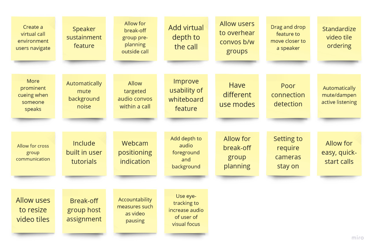
I used digital sticky notes to keep my braindump clean and organized
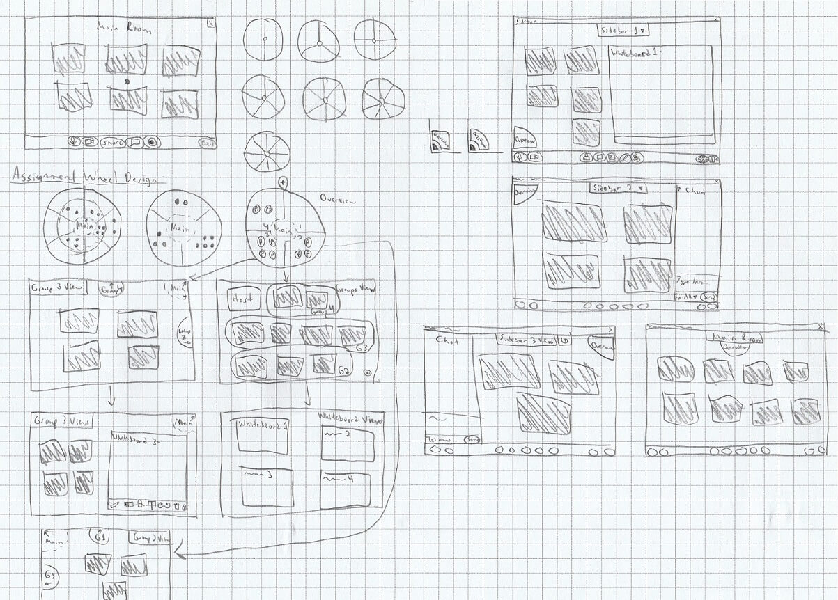
What is a design project without sketches?
Sketches
As I went through the process of generating ideas, I sketched out some concepts to help get visuals and play around with potential designs. Gradually, a design involving a radial sidebar call structure developed.
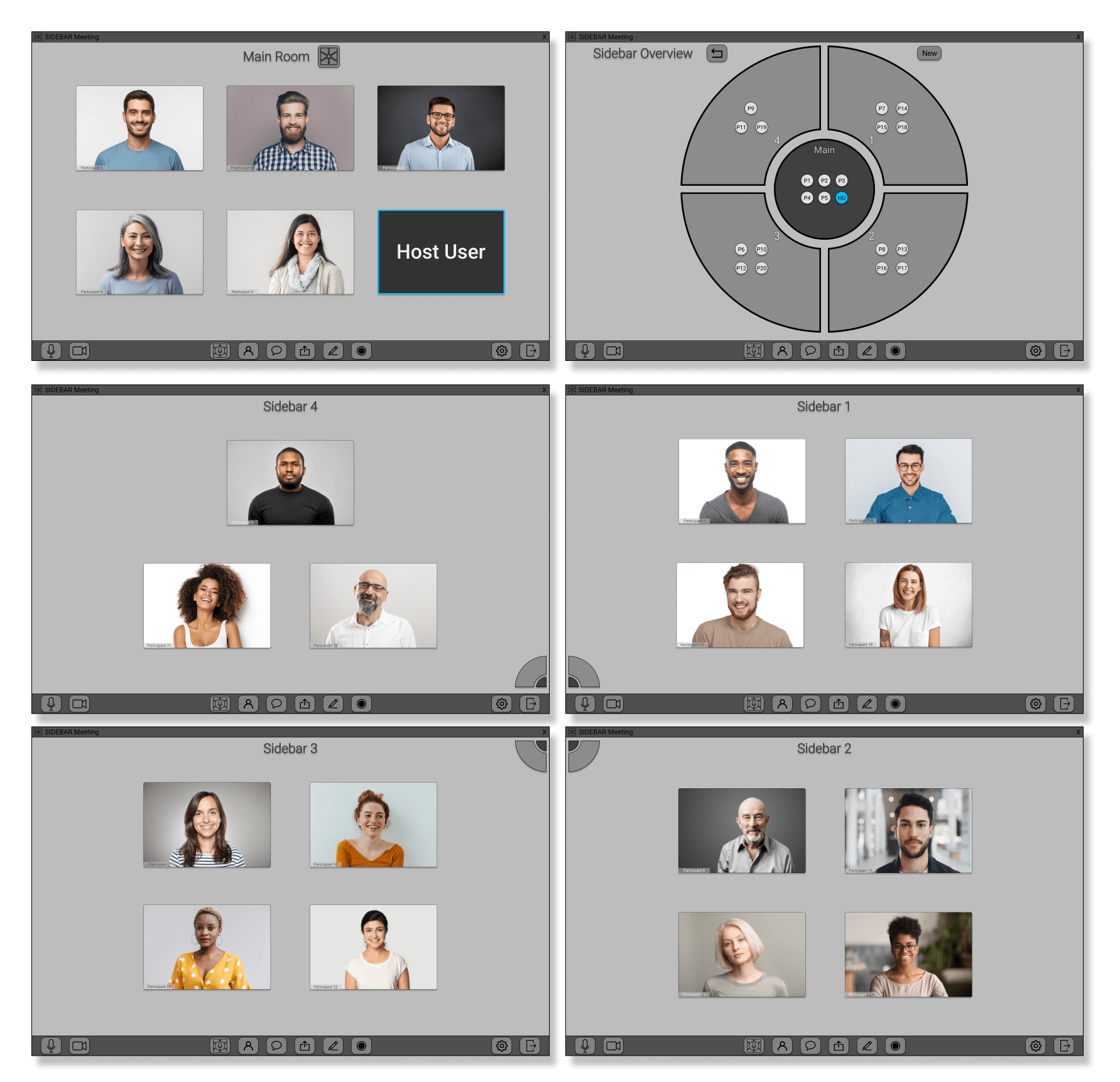
A bare bones design with a lovely grey color palette
Initial Prototype Feedback
Having gained a firm idea of my intended design, I created a mid-fidelity clickable prototype using Figma. I focused mainly on getting a feel for basic navigation functionality and the virtual structure of the call while deprioritizing visuals to get feedback before progressing further with the design.
Feedback was positive overall and constructive in helping guide further prototyping.
- Allowing break-off groups to be more fluid and easy to navigate makes it quick and simple for people to have sidebar conversations within a call and achieve more effective communication.
- Additionally, I received valuable recommendations on visual improvements to elements such as the taskbar and the sidebar overview wheel.
Outlining Use Cases
From this initial feedback, I dove back into more sketching. Also, I took the time to outline various scenarios in which my personas would use Sidebar and actions they might try to do within those scenarios. I detailed their motivations and then outlined one or two options for completing an action in Sidebar. I used new sketches as references to help visualize the personas working through the steps of completing each action. This activity helped iron out the functionality relevant to certain scenarios and acted as a means of evaluating the workflow for any missing components in the design.
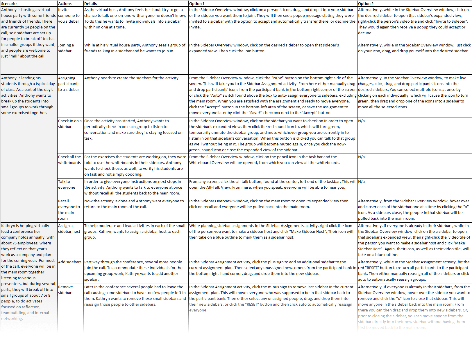
These are likely use cases for Sidebar
Hi-Fidelity Prototype
With a new direction, I took a second crack at prototyping, aiming for a high-fidelity deliverable that nailed down more functionality and focused more on including appealing visuals and helpful signifiers to improve usability. Here's a peak at how it turned out:
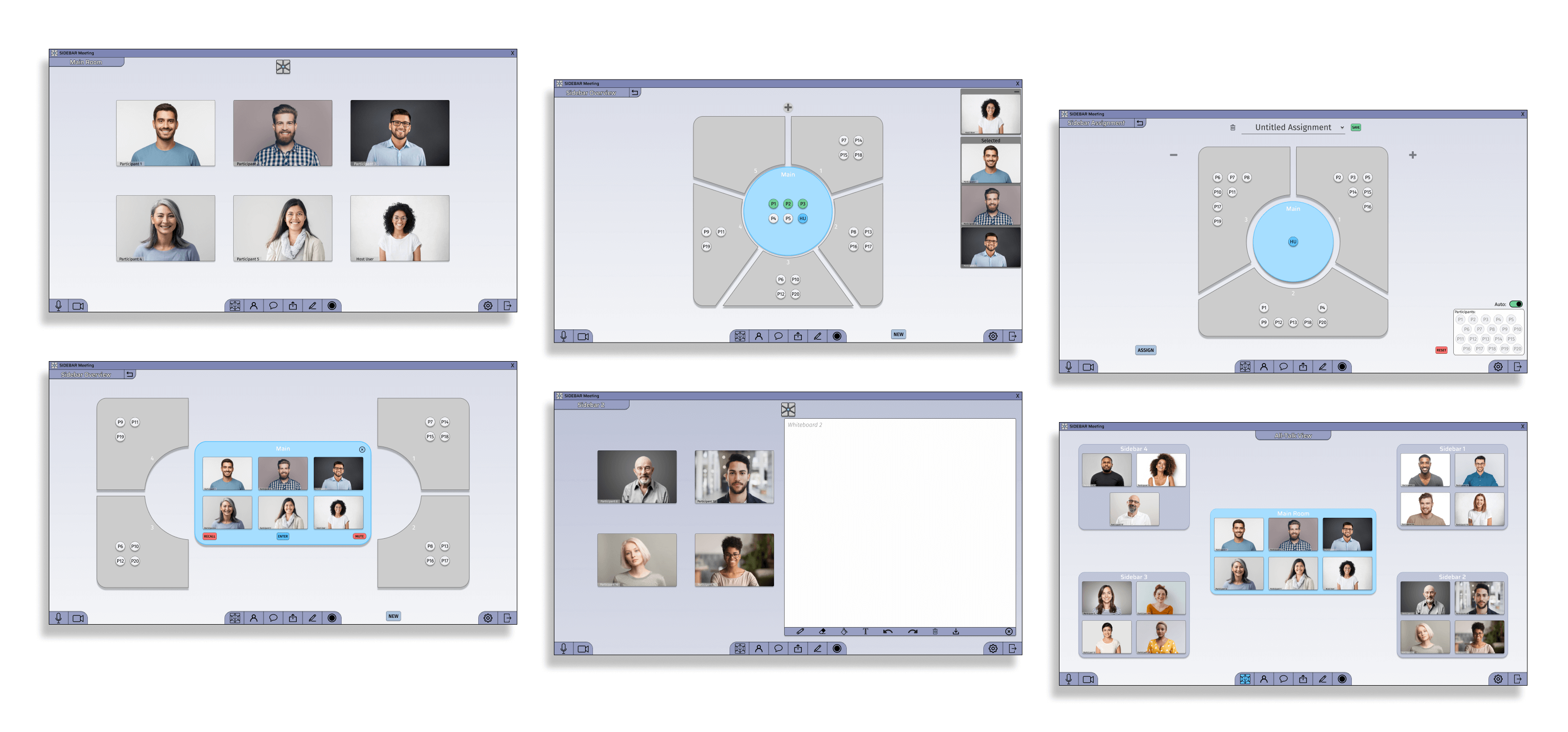
New and improved!
Addressing Pain Points
Pain Point 1: No side conversations
- Allowing break-off groups to be more fluid and easy to navigate makes it quick and simple for people to have sidebar conversations within a call and achieve more effective communication.
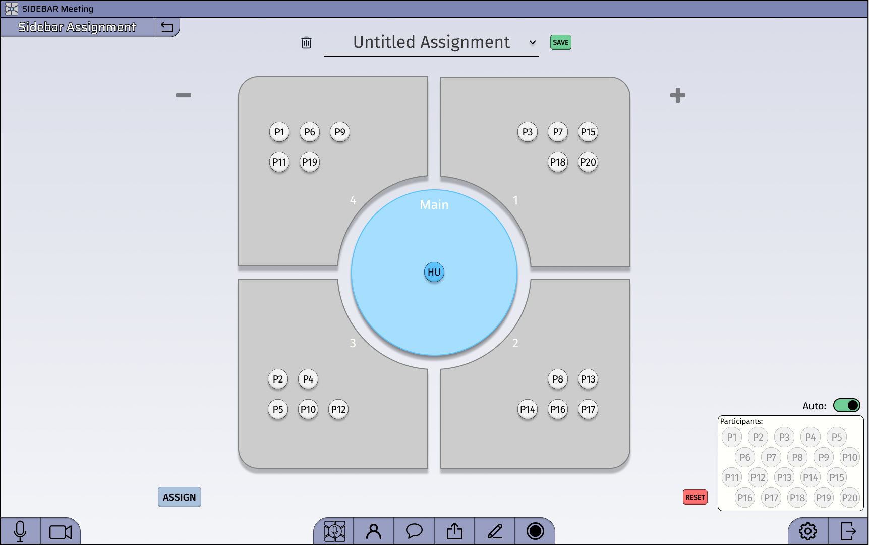
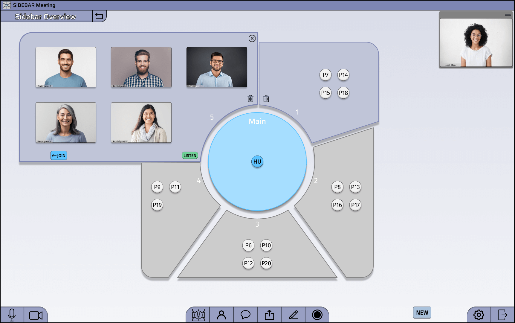
- You can easily add new sidebars to the call and move people from sidebar to sidebar as needed, giving the impression of a fluid environment that call participants can navigate.
- Alternatively, a sidebar assignment can be planned out and saved on more structured calls, such as remote schooling, until later in the call when needed.
Pain Point 2: Lack of accountability
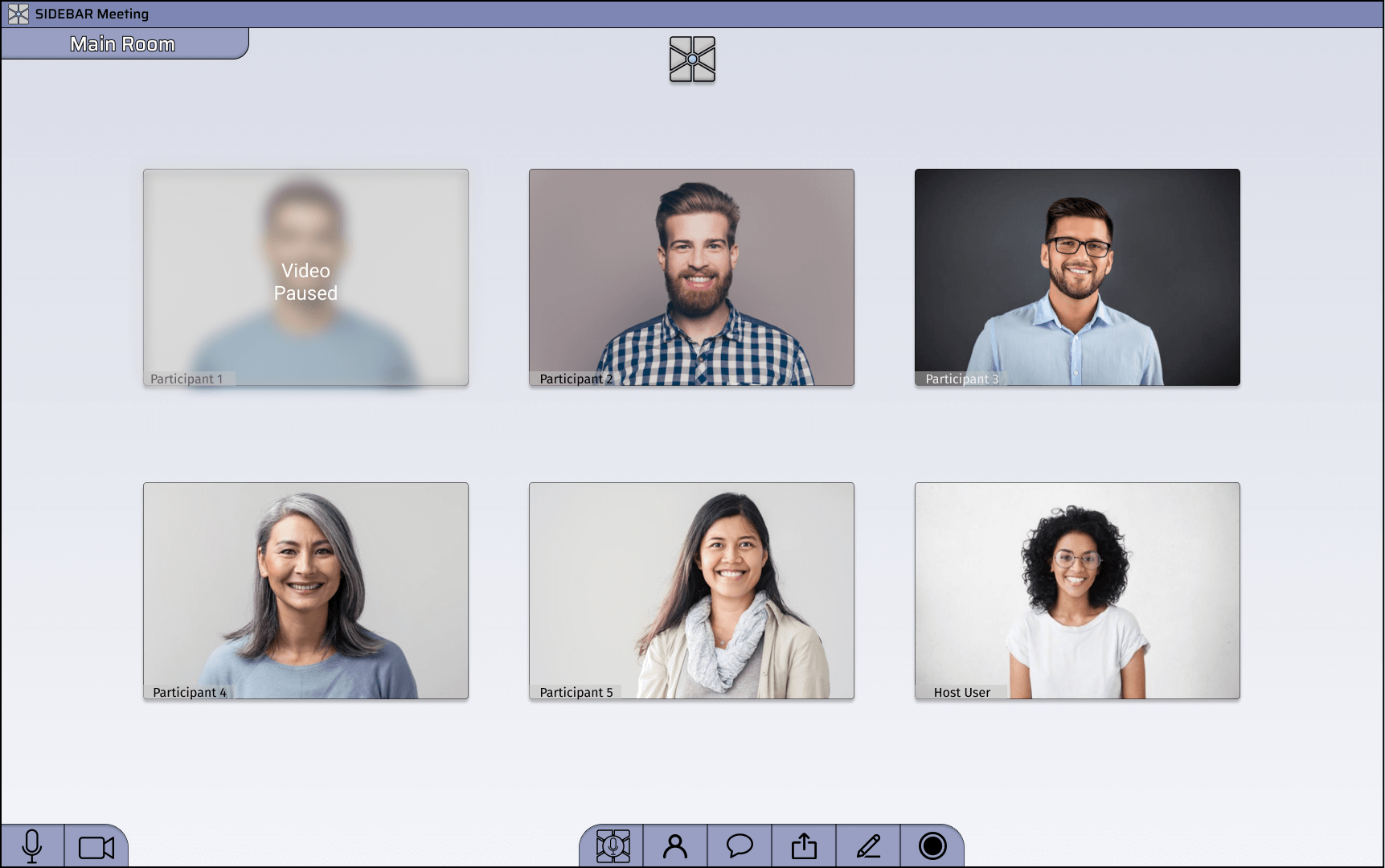
- A "Video Pause" feature, akin to what Apple's FaceTime uses, provides a remedy to accountability. If someone does not have the Sidebar application open and active, their video tile will blur and say, "Video Paused."
- There are settings to exempt specified secondary applications that won't pause your video, such as note-taking applications like OneNote, Microsoft word, or Apple Notes, to help prevent making this feature a nuisance.
Pain Point 3: Difficulty with turn taking
- Video tiles are more prominently highlighted when some attempts to speak, better-alerting others.
- Additionally, Sidebar utilizes audio modulation to minimize disturbances when someone is speaking. It does this by muting background noise and other noises below a certain decibel range.
UI Style Guide
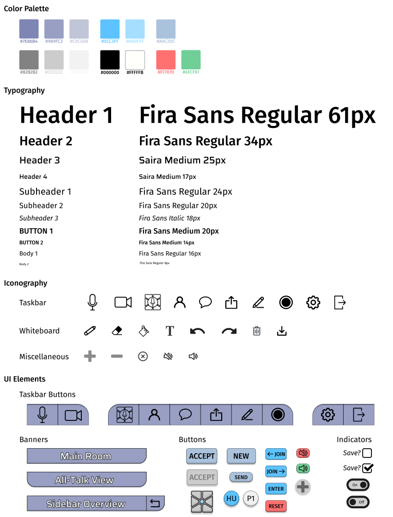
Retrospective Note
The main thing I would change about this design is the UI: the icons don't share a homogenous weight and complexity, the buttons feel cramped and chunky, and the color choice is not great. Starting out in UX, visual design was not my strong suit (as you might guess from this UI), but I'm learning and I can say with confidence that I've already come a long way.
--November 2022
Usability Testing
To help validate my project, I conducted usability testing with several primary users. I wrote a script outlining a general-use scenario and asked the test users to navigate the call application and explore various functionality.
During the test sessions, I received valuable feedback on how intuitive the navigational elements of the application felt, what elements were visually appealing, and how interested people were in Sidebars key functionality, such as the Overview Wheel, which was well received. I was also given some suggestions for additional features I could add in the future. Overall feedback was highly positive, making hopes of future success very promising.
Conclusion
Currently, Sidebar is not yet a complete product, so the impact of my design is to be determined down the line once I'm able to conduct legitimate product testing. Regardless, the project is off to a great start, and the design seems to have much potential in the future.
Sidebar is my first design project; thus, as to be expected, I experienced some trial and error. I had limited experience with Figma before starting this project, so as I was working, I often discovered new tools and methods that were much more efficient than what I had been doing up to that point. And nine times out of 10, this led me to spend time redoing parts of my project to make things cleaner and practice doing something right. Redoing work led to the project taking longer than I had intended, but I saw this extra time as a worthwhile investment since the primary goal of this project was to learn and develop my skills as a designer. Apart from now being way more competent in using Figma, I also learned how to document my work better to produce deliverables as I go and recount my journey to others after the fact. Additionally, I learned how to better focus my work on what is most important to the user while being practical.

 Home
Home
