Citibank Lead Form Redesign
Increasing conversion rate by optimizing form design
April - November 2022
Click anywhere to exit
Small Business Special Offer
Citibank offers various financial services such as Branded Credit Cards, Retail Service Partnerships, Banking, and Wealth Management. Before this project, Citi had an existing web page for a promotional offer on its Small Business Checking Account. The main objectives of this page were to provide an overview of the offer and capture the user's contact information through a lead form, which is then sent to the Citibank branch nearest their business.
I worked as the experience designer on a team at Razorfish, tasked with optimizing the design and functionality of the web page and lead form to improve user experience and boost conversion. For this project, I collaborated with a visual designer, copywriter, creative director, and development team to successfully redesign and deliver an enhanced experience.
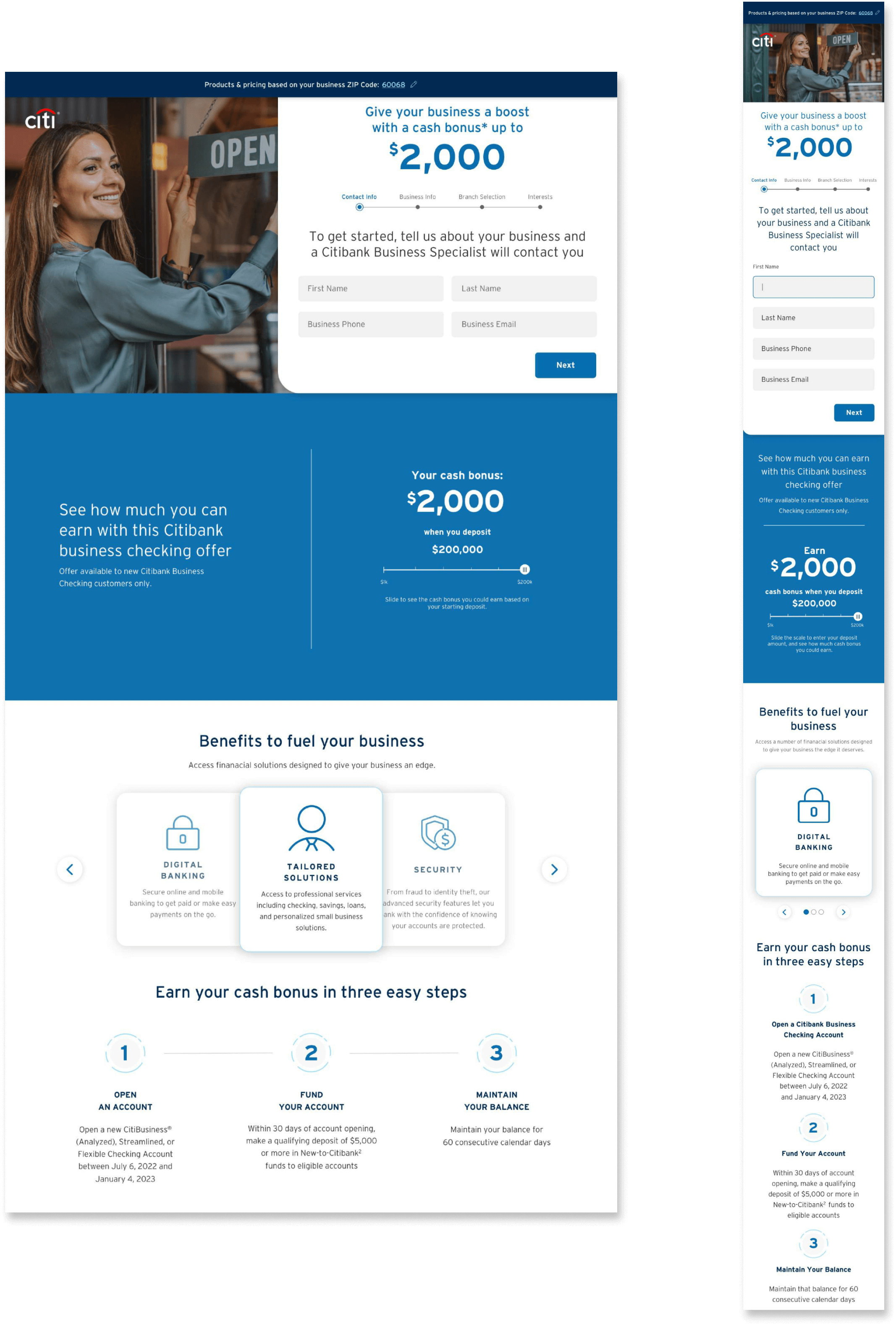
This is the redesigned page, check it out before we dive into the design process
Purpose
Our goal in redesigning this web page was to improve the experience of the small business owners interested in Citi's offer. Specifically, we aimed to provide these users with clear information about the offer, engage them with interactive elements on the web page, and eliminate friction and errors they might encounter around accessing (or not accessing) the form based on their location. In addition to these aims, we sought to produce a design that met compliance from Citi's legal team and satisfied the requests of the key stakeholders.
Requirements
As part of the scope of this project, stakeholders from Citi requested that we adhere to specific requirements:
- This offer is location dependent, so the user has to enter a zip code before viewing the form. Anyone ineligible for the offer based on location had to be redirected elsewhere.
- Most existing content had to remain on the page but could be presented differently.
- We were expected to create multiple designs for the Citi stakeholders to review.
Approach
This project consisted of two month-long phases of three rounds of review with Citi Stakeholders. Below are short summaries of each phase. For a deeper dive into specifics, expand each phase's "Read More" section.
Phase One
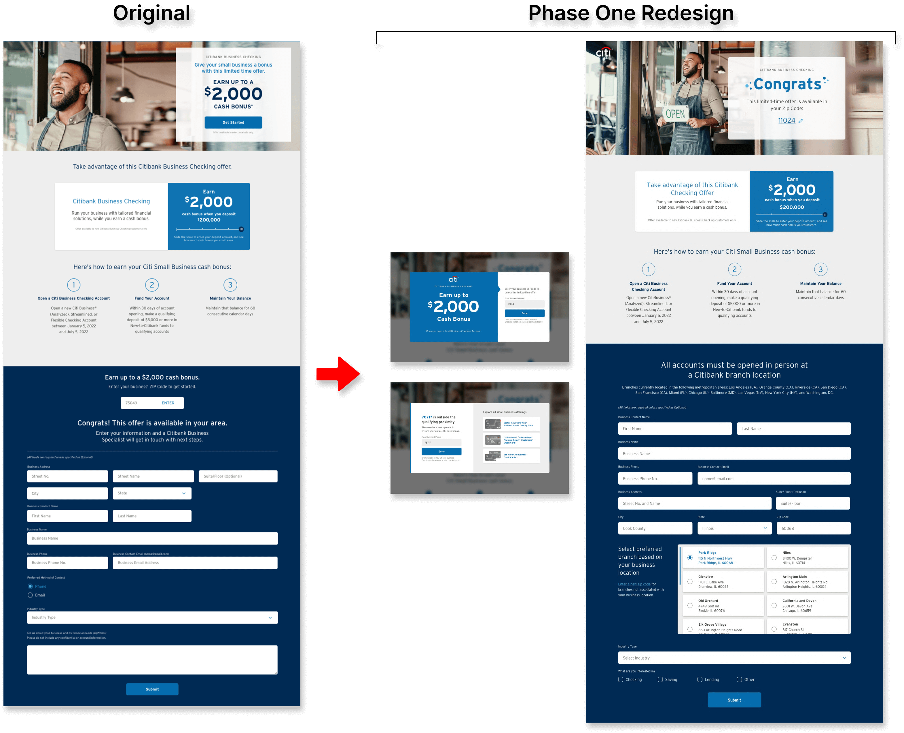
Phase Overview
In the project's first phase, we focused on providing more minor design improvements that could be quickly implemented to the existing web page. In particular, we cleaned up the flow and logic around the zip code entry that triggers the form, shifted around some of the page content, and added a bank branch selection to the lead form.
Read More

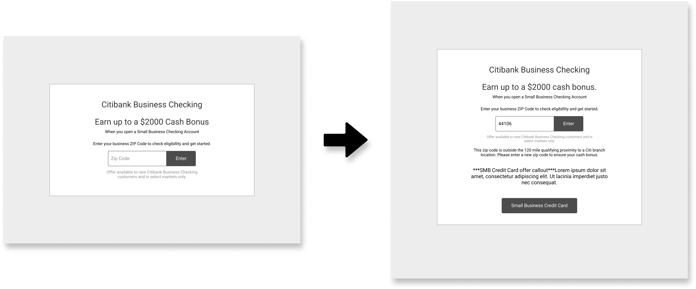
Zip Code Entry Modal Wireframes
Zip Code Entry
In the previous webpage experience, anyone could visit the page and learn about the offer, including small business owners who were ineligible for the offer based on their location. These individuals were not filtered out until they scrolled down the page and entered their zip codes.
To avoid the frustration that this might cause ineligible users and capitalize on an opportunity to redirect these users, we brainstormed alternative methods for determining the users' location, ultimately opting for an entry modal on page load.
Error Mitigation
In addition to changing how the user enters their zip code, we put a lot of thought and discussion into accounting for edge cases, such as users misentering their zip code, which could lead someone ineligible to fill out the lead form. An added layer of complexity is that two different location groups are eligible for the offer but have to fill out different variations of the form. Thus, someone might misenter their zip code and then be taken to one variation of the form when they should be taken to the other variation instead.
To identify all of these edge cases, I mapped out the page's user flow to ensure we captured all of these potential scenarios and called out important elements of the page functionality that had to be accounted for by the development team.

Standard User Flow
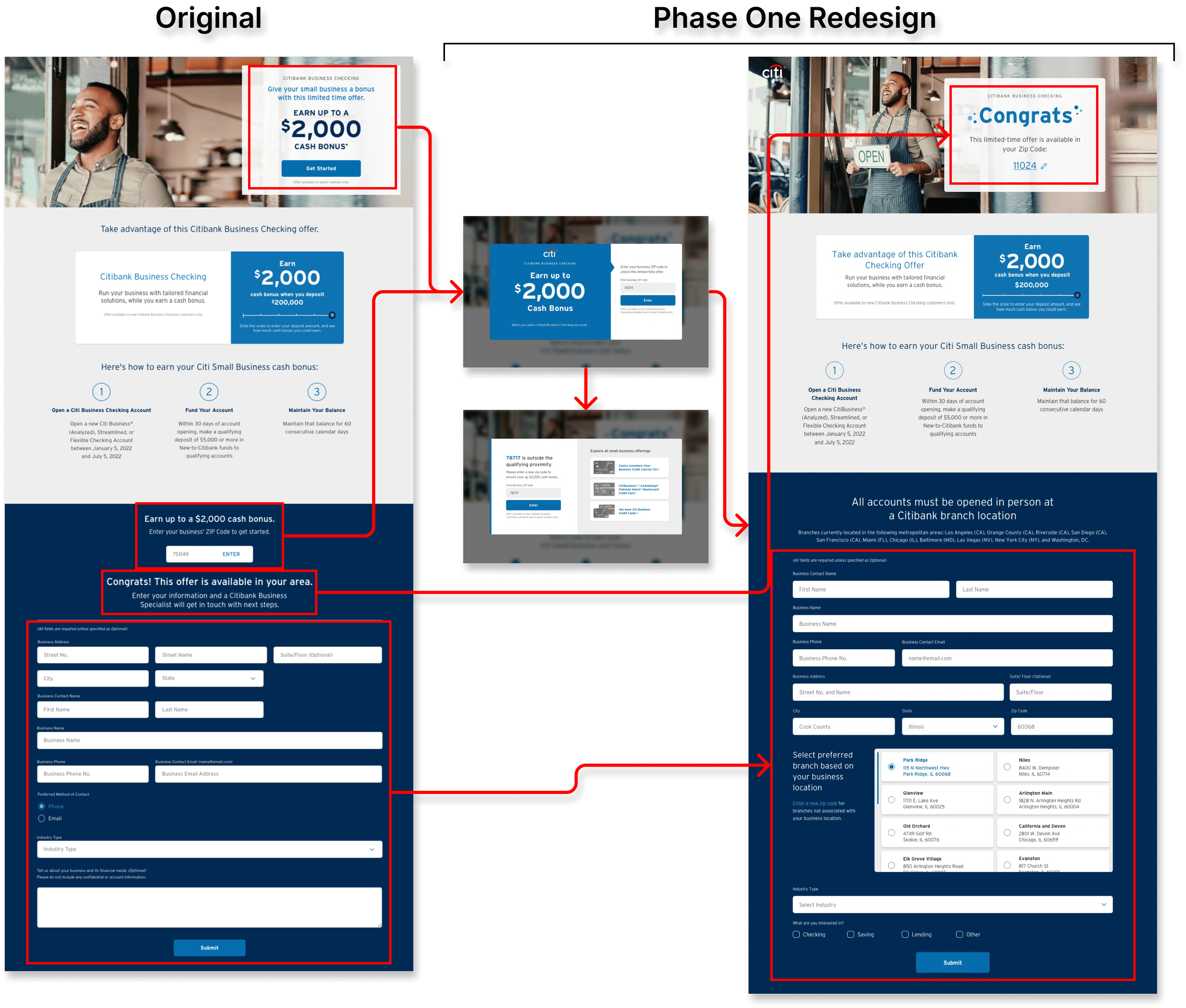
Phase One Design
By the end of this project phase, the major design alteration was adding a zip code entry modal to the start of the page experience. Users who enter an ineligible zip code are presented with alternate small business offers but are also given the option to enter a different zip code. Once on the page, users can correct their zip code via a reentry modal, and, if applicable, the form will switch to the appropriate version or redirect those ineligible.
In addition to this functionality, we rearranged various lines of copy and page content, adjusted some of the form fields, and added a branch selection interface.
Phase Two
Phase Overview
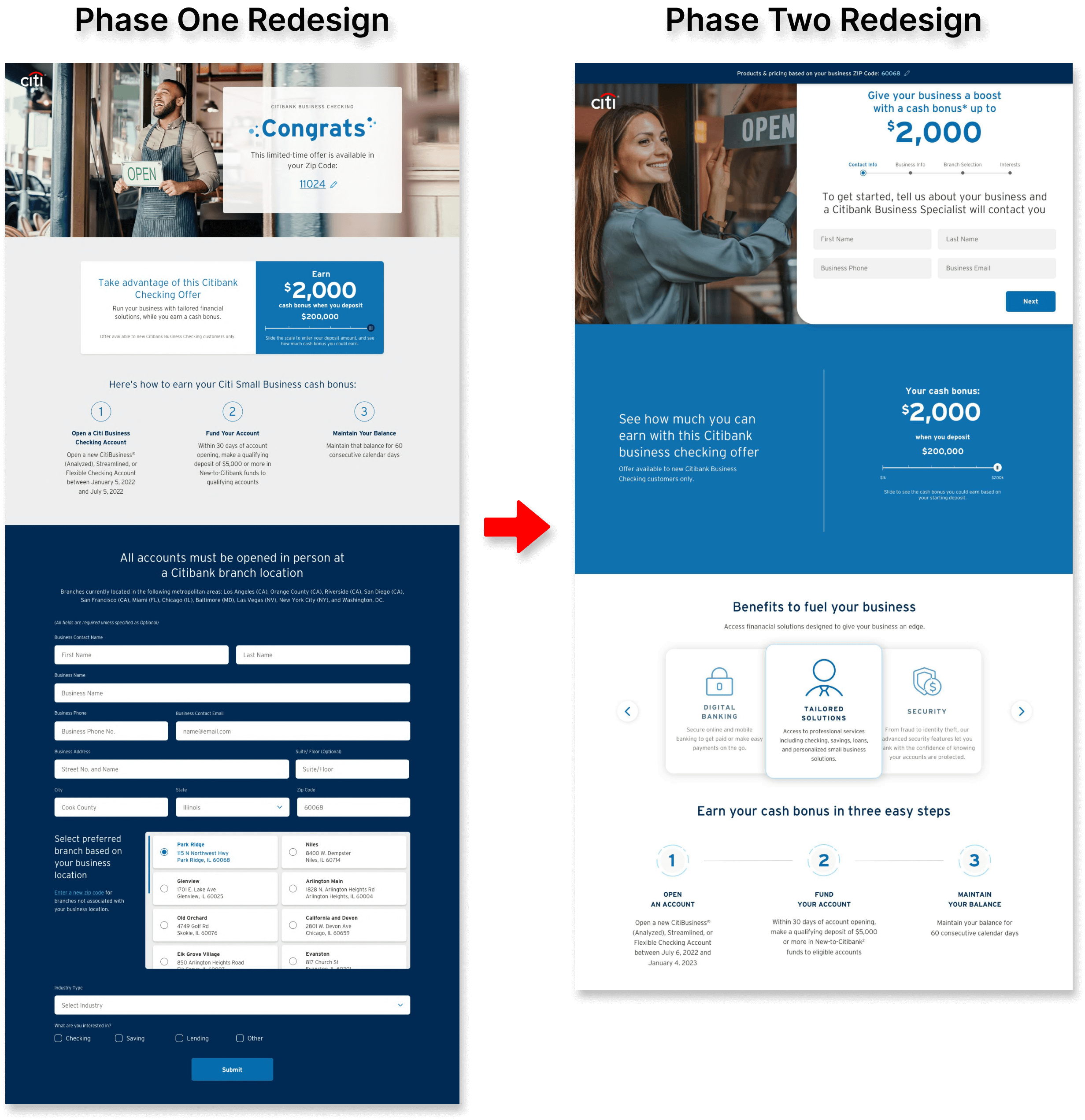
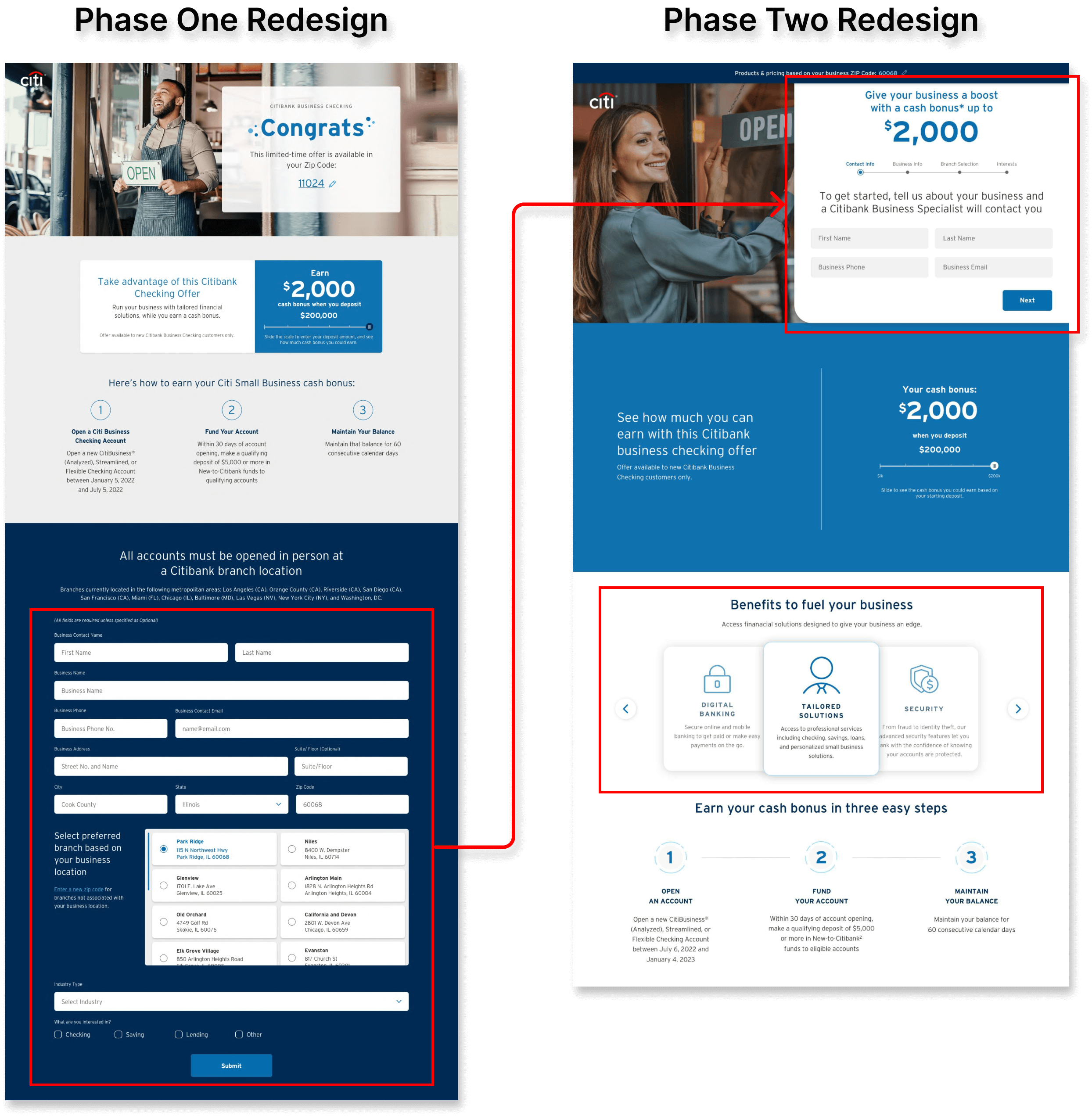
In the project's second phase, we took greater creative liberty and sought to provide the best possible experience within the project's scope. Specifically, we sought to reevaluate the form experience itself, rearrange the page layout to improve form engagement, and add content that provided additional information about the offer for users.
Read More

Above the Fold
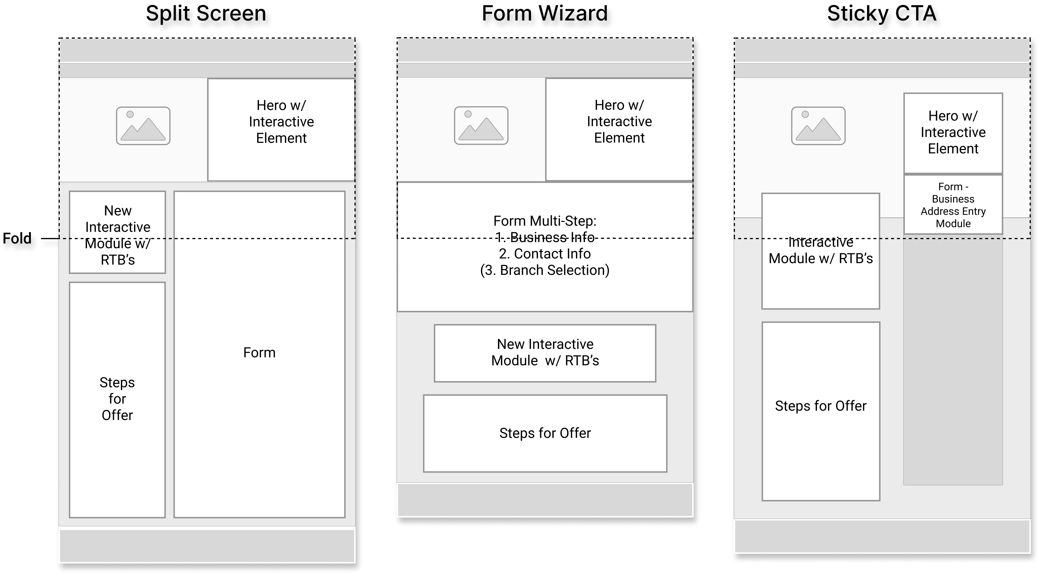
After completing phase one, our first priority for phase two was to improve form engagement by positioning it higher on the page. Testing before this project showed that in the form's original position, only 30% of users scrolled far enough down the page to see the form. That is a huge issue. To fix this, we played around with various designs that at least partially brought the form up above the fold of the page.
Form Wizard
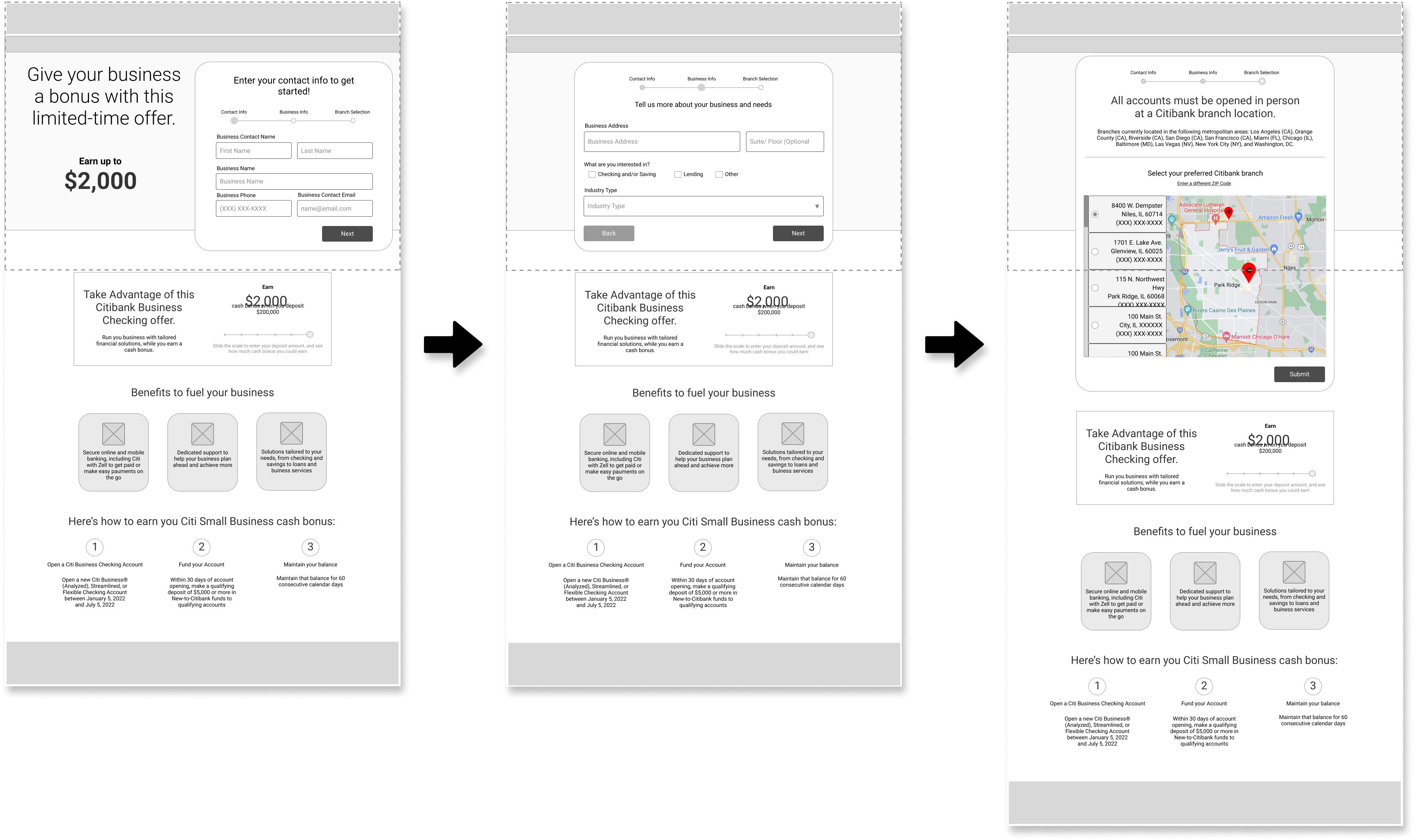
From these different designs, we determined that the solution that fits best above the fold was a form wizard design. By breaking the form into smaller chunks, the form fit above the fold, was more easily integrated with some of the other content on the page, and was made less daunting for users to get started. On top of all this, using a wizard allowed us to make the form the clear priority of the page, which was not clear in the original design.
Phase Two Design
By the end of project phase two, we gave the page a nice facelift that offered a much more streamlined experience. The form wizard design makes the form more noticeable and approachable. An additional interactive module provides more information about the offer and promotes page interaction. And content and copy are further optimized to clear up the page's messaging.
24%
Lift in form submissions across devices
32%
Increase in form interaction on on mobile
Improved Performance
Following the completion of the page redesign, we ran a month-long test comparing the new design against the previous page design. Traffic was split between the two variations of the web pages, and we tracked users' clicks and submission rates on both pages. From this test, results showed that the form redesign and added informational module had a positive impact on page conversions
Conclusion
This was my first time working with this team, though they knew one another. Thankfully this was not an issue, I managed to jump right in, and the team deferred to me on matters involving user experience even when there was unanimous agreement. There were a few instances of circular discussion, but these were a good opportunity for me to practice not adding to the issue and instead refocusing the conversation on what is most important for the user and what is within the given scope.
Other than team dynamics, the biggest challenge was adhering to the narrow scope of making only smaller adjustments to the page and its elements during phase one of the project. However, this did have the positive effect of forcing us to get creative, as did having to produce multiple variations for each round of review. Fortunately, any ideas we came up with that were outside the scope of phase one were far game to include in the redesign during phase two.
Overall, this project was quite successful. Though the entire project spanned multiple months and several rounds of review, each phase was approximately only a month, with time between phases resulting from testing and delays on Citi's end. Thus, given the small team and quick turnaround, a 24% performance improvement is a very gratifying result!

 Home
Home