Accessibility Map 2.0
Providing navigational directions that match your access needs
June - October 2022
Click anywhere to exit
Accessibility for Everyone
Accessibility affects everyone, not just individuals who are disabled. For instance, carrying an armload of groceries puts someone in a situation where a manual door becomes a barrier. Crushing a challenging leg workout at the gym for the first time in weeks might leave someone unable to use stairs for a few days. And visiting a new building without proper guidance can leave someone lost and unable to make it to their destination on time. Each of these situations involves a struggle with accessibility. Everyone has unique access needs at different times and in different situations; thus, everyone has the potential to benefit from a tool that supports accessibility, not just people with disabilities.
This project is the new and improved version of the Accessibility Map project I discussed in a separate showcase. The showcase for that Accessibility Map, which I will refer to as AM 1.0, goes a little more in-depth on background research and goals that motivated the overall product. Though optional to follow along with this project, if you want more context, you can check out the AM 1.0 showcase first and then come back here. To showcase this project, which I'll refer to as AM 2.0, I will outline improvements from the initial map experience and delve into the design considerations that brought about those improvements. I completed this project on my own over approximately five months. Development of the improved map is still underway when writing this.
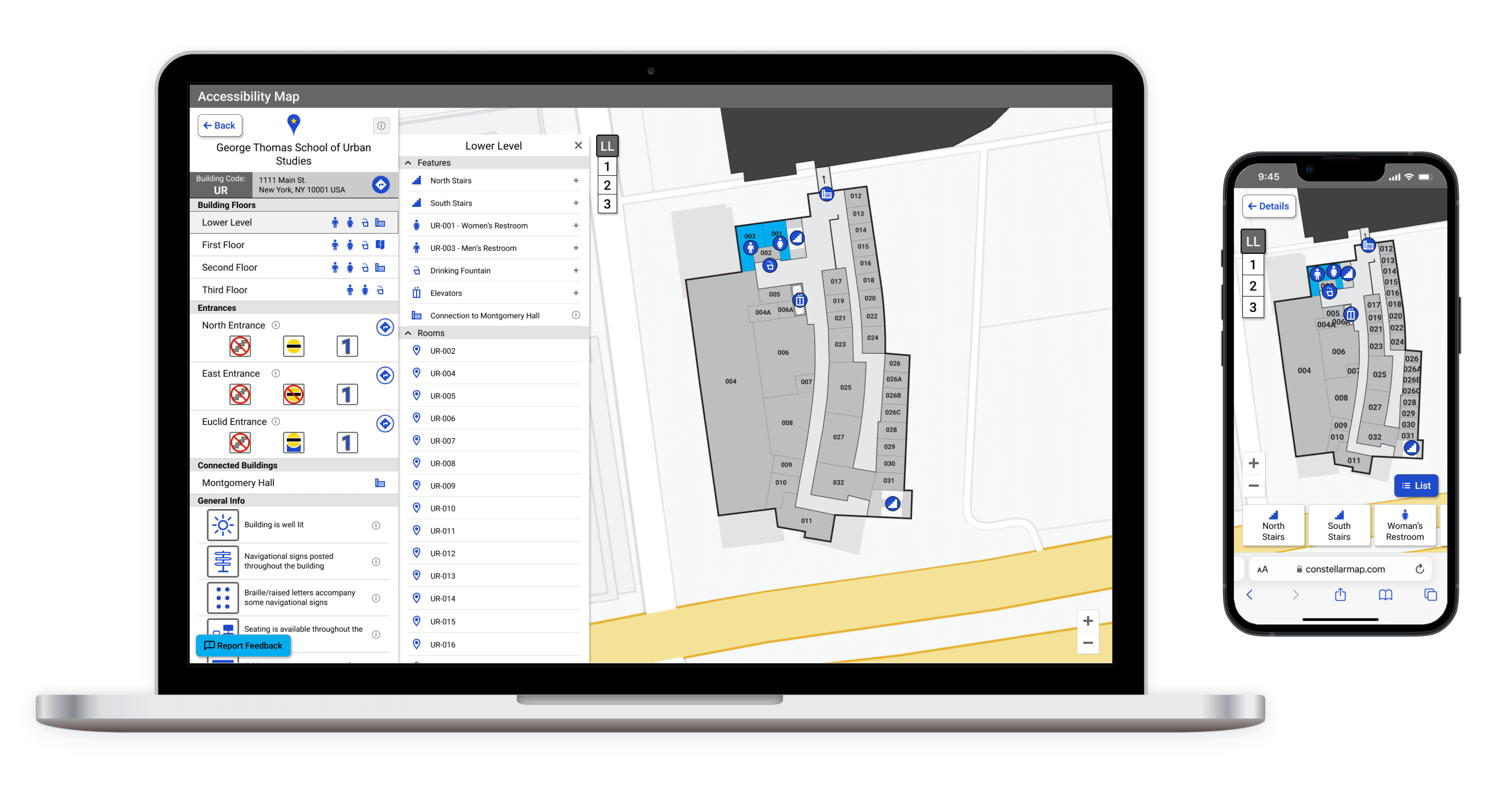
This is the Accessibility Map 2.0!
Purpose
AM 1.0 was the first iteration of the accessibility map, meant to be a stepping-stone toward a more expansive and impactful project. AM 2.0 is the next step. This project is the culmination of feedback and lessons from the previous project, mixed with fresh ideas and greater adherence to universal design principles. The result of my effort is a tool that goes beyond providing only generalized information about building accessibility to providing detailed building information and access-specific navigation support that everyone can benefit from.
Requirements
To expand upon the feature list of AM 1.0 and improve upon its overall design, I sought to accomplish the following:
- Make the AM more broadly applicable so that anyone can benefit from it.
- Improve the usefulness of the AM by presenting more details about each building.
- Continue to provide an accessible and inclusive experience.
Approach
This project consisted of four phases: Discover, Define, Develop, and Deliver. Below are short summaries of each phase. Expand each phase's "Read More" section to dive deeper into specifics.
Discover
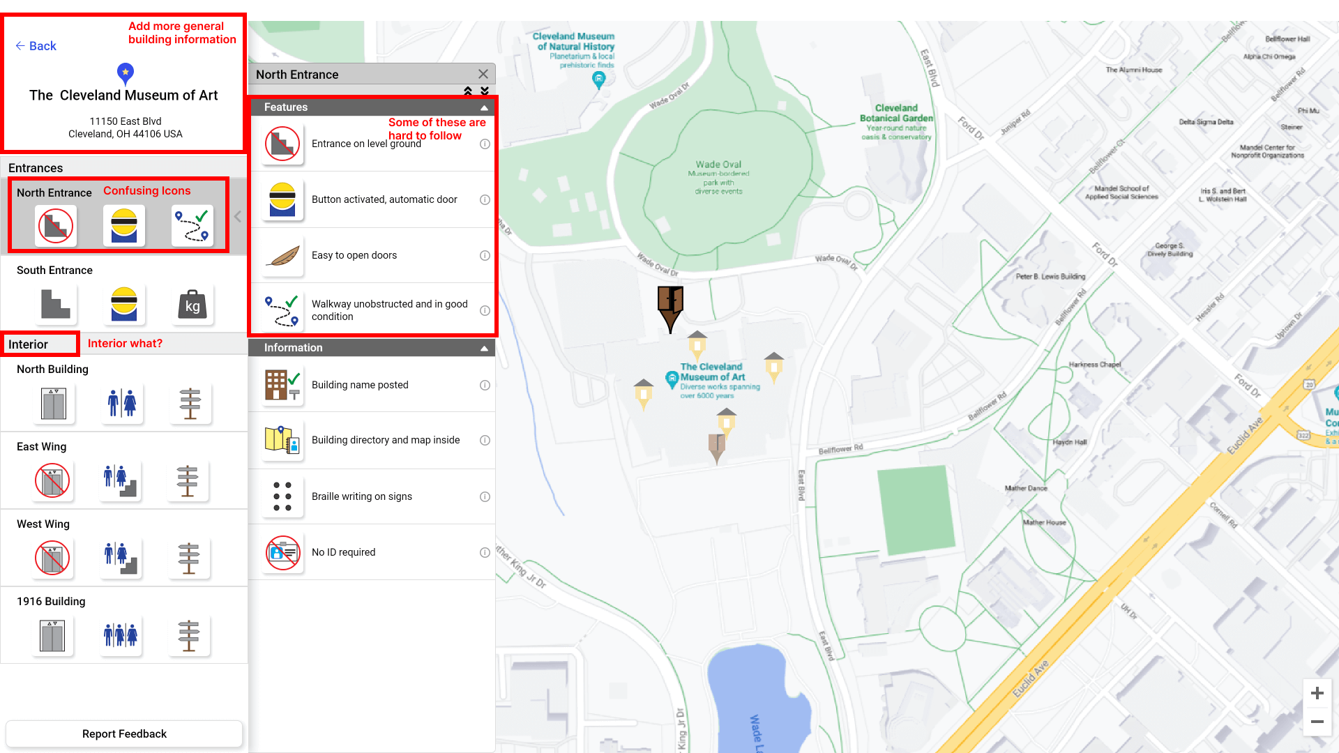
Above is a screenshot from AM 1.0 with feedback marked
Discover Overview
The first phase of this project was the Discover phase. During this phase, I aimed to gain insight into how I might improve AM 2.0 by looking back at my work on AM 1.0 and trying to understand better the product space in which AM 2.0 will sit. Looking back at AM 1.0 was the ideal place to start because I gained a lot of feedback, insights, and lessons from that project that gave me a clear idea of some things I needed to improve.
To put the improvements I had in mind in perspective, I conducted competitive research on various college campus maps and other businesses that offer mapping services. From this research, I pulled a list of features and elements to include or avoid and gained insight into what aspects of the accessibility map make it unique.
Read More

Uncovering Unknowns
When I created AM 1.0, I intended for it to be more than just an MVP, but, at the same time, there was no expectation that it would be a complete solution. The project completed for Cleveland State University was the first of its kind; thus, it was a pilot project in many ways. Going into the project, we faced a lot of uncertainty and unknowns. How difficult would it be to collect accurate and complete data? How much information is too much and thus infeasible to collect? How much information is too little to create a useful tool?
Reaching the end of the project, I came away with feedback and insights that were foundational to the goals of AM 2.0. To give some highlights, I learned the following:
- Collecting general building information made it harder for data collectors because it left more room for subjectivity.
- Some buildings have unique and inconsistent features that need to be dealt with in a case-by-case manner.
- Accessibility issues in a building are sometimes the sum of the whole rather than the result of individual features in an environment.
Common Campus Map Features
In addition to using feedback and past research to guide AM 2.0, I wanted to familiarize myself better with what is commonly included in campus maps today. I looked at 44 schools from across the US and assessed the following:
- What modality of map does each school use: interactive, static pdf, or both?
- If they have an interactive map, what map service do they use?
- What type of information do they show on their map?
- Do they provide accessibility information?
- If they do provide accessibility information, how is it presented?
- Do they provide interior maps/navigation?
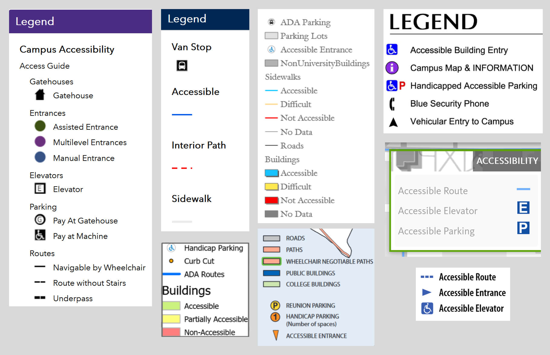
A collection of map keys, taken from various campus maps, that call out accessible features
After reviewing these schools, some generalizations I was able to extract from my findings were:
- Almost all schools have interactive maps though a handful still only have static pdf maps.
- Information about buildings usually included a mix of building name, address, type, and description, though not always all 4.
- About half of the campus maps did not include any accessibility information.
- Most of those that did provide accessibility information provided very general callouts such as "Accessible entrance," "Accessible pathway," or even "Accessible Building" without defining who these things are accessible to.
- Though almost no schools explicitly state who "accessible" features are accessible to, the accessibility information seemed to apply to wheelchair users mainly.
- A small portion of schools had standalone accessibility maps that provided more detail. However, these were either static maps or maps with minimal interactivity.
- Nearly all maps, even those that provided accessibility information, were inaccessible due to contrast issues, lack of screen-readability, and missing keyboard navigation support.
Competitors
After better understanding the landscape of campus maps, I looked deeper at the mapping solutions currently on the market to see what tools and services competitors offer. I sought out various companies that provide interior-navigation solutions or accessibility mapping/navigation solutions. I collected a list of 10 potential competitors. To the right, you will find a table that shows notes for 6 of these companies. Some key insights were the following:
- Several companies offer interior turn-by-turn navigation, but they all generate this output through different technical solutions.
- Only a few companies provide accessibility-focused interior navigation support, and those that do, suffer from poor usability or fail to provide a product that benefits a broad audience.
- Most of these companies work with universities to some extent though their clients are mainly retail spaces, large venues, business complexes, and hospitals.
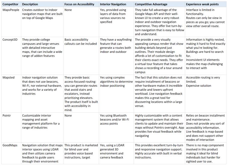
Competitor analysis data for 6 of our competitors
Define
Define Overview
During the Define phase, I took the insights I pulled from the Discover phase and used them to define this project's scope and the design requirements I wanted to focus on, outlined earlier.
A central theme of this project is to make the accessibility map an inclusive, practical, and usable tool for everyone. AM 1.0 is a tool that is predominately useful to people who are disabled, which was the primary goal, yet, its narrow focus makes it unappealing and useless to anyone who doesn't consider themselves disabled or in need of accessibility support. Thus, to make this an inclusive tool, I decided to lean into the principles of universal design, focus on providing a level of detail that is more widely useful, and add interior building-navigation functionality that would benefit anyone navigating campus.
Read More

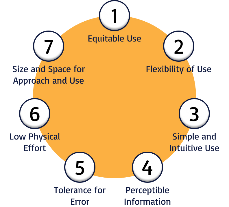
Principles of Universal Design
There are seven principles of universal design (shown to the left). AM 1.0, all the campus maps I reviewed, and all the competitor products I came across violate one or more of these principles in some way, meaning all fall short of offering inclusive user experiences. In these failings, there were clear opportunities to avoid the same mistakes when creating AM 2.0. So to create a product that significantly improves upon the foundation AM 1.0 laid and is a highly competitive solution, I leaned into the seven principles to help guide my design.
Level of Specificity
A map is only as good as its data quality, and AM 1.0's most significant shortcoming is its lack of specificity. As I mentioned earlier, this generality was a byproduct of many unknowns at the time of AM 1.0's conception. But, with a better understanding of what sort of information is feasible and necessary to collect, AM 2.0 can do more.
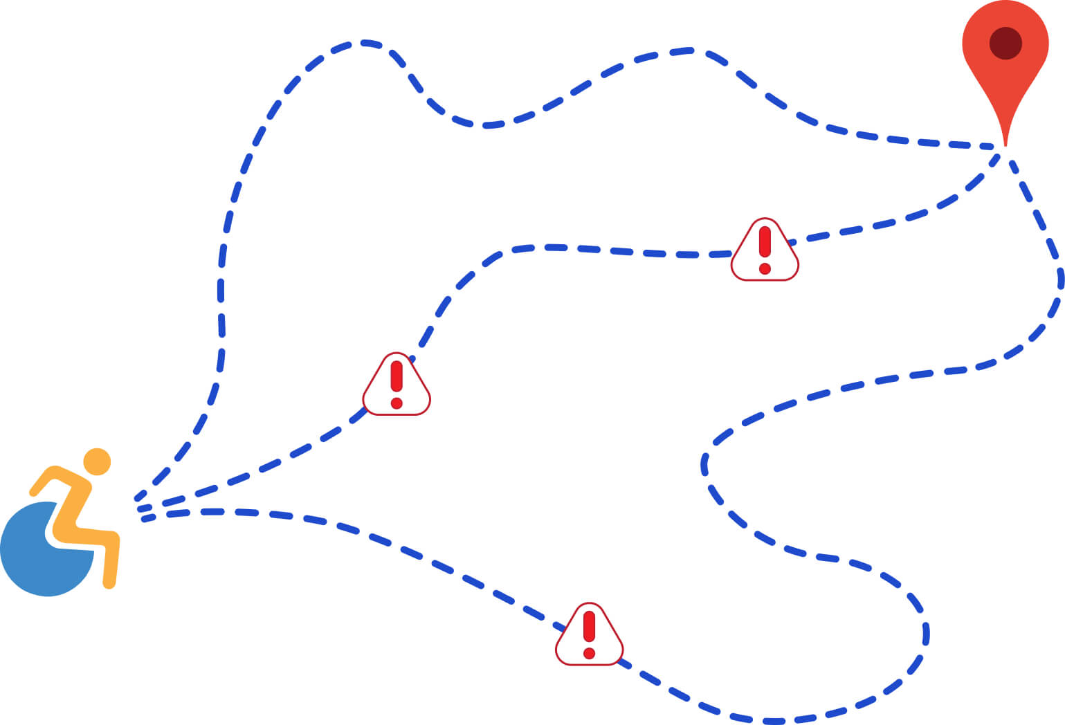
Providing general information not only offers a mediocre improvement over a campus map that calls out an "accessible entrance" or "accessible pathway" but also violates the Principle of Simple and Intuitive Use. Not tying information to a more specific location on the map makes it harder for users to determine the value or relevance of the information presented. Learning that a building doesn't have elevators wouldn't appear to be an issue for a male wheelchair user who only needs to visit the first floor, but it would be a problem if that same building also didn't have any male restrooms on the first floor. Looking at a building from a macroscopic level prevents us from seeing how features within a building connect to shape the whole of a user's experience. Only by identifying information at more specific locations within a building can we clearly depict what sort of navigation experience someone might have.
Supporting Inclusion
In the AM 1.0 showcase, I list various groups that make up the intended user population of AM 1.0. For AM 2.0, this list is simultaneously shorter and longer, as it is the following:
- Everyone
Beyond providing a visual overview of campus with a list of campus buildings and their addresses, which is the same content most campus maps provide, AM 1.0 does not offer value to someone uninterested in access-related details. Creating a tool that is mainly appealing and beneficial to individuals with disabilities violates the Principle of Equitable Use. Most violations of this principle involve the opposite situation, but it's a violation nonetheless. Thus, for AM 2.0 to be a more inclusive product, it should bring more apparent value to everyone. The best opportunity here to create an inclusive design is to focus on creating a tool that provides interior navigation for everyone and access specific support for those who need or want it.
Develop
Develop Overview
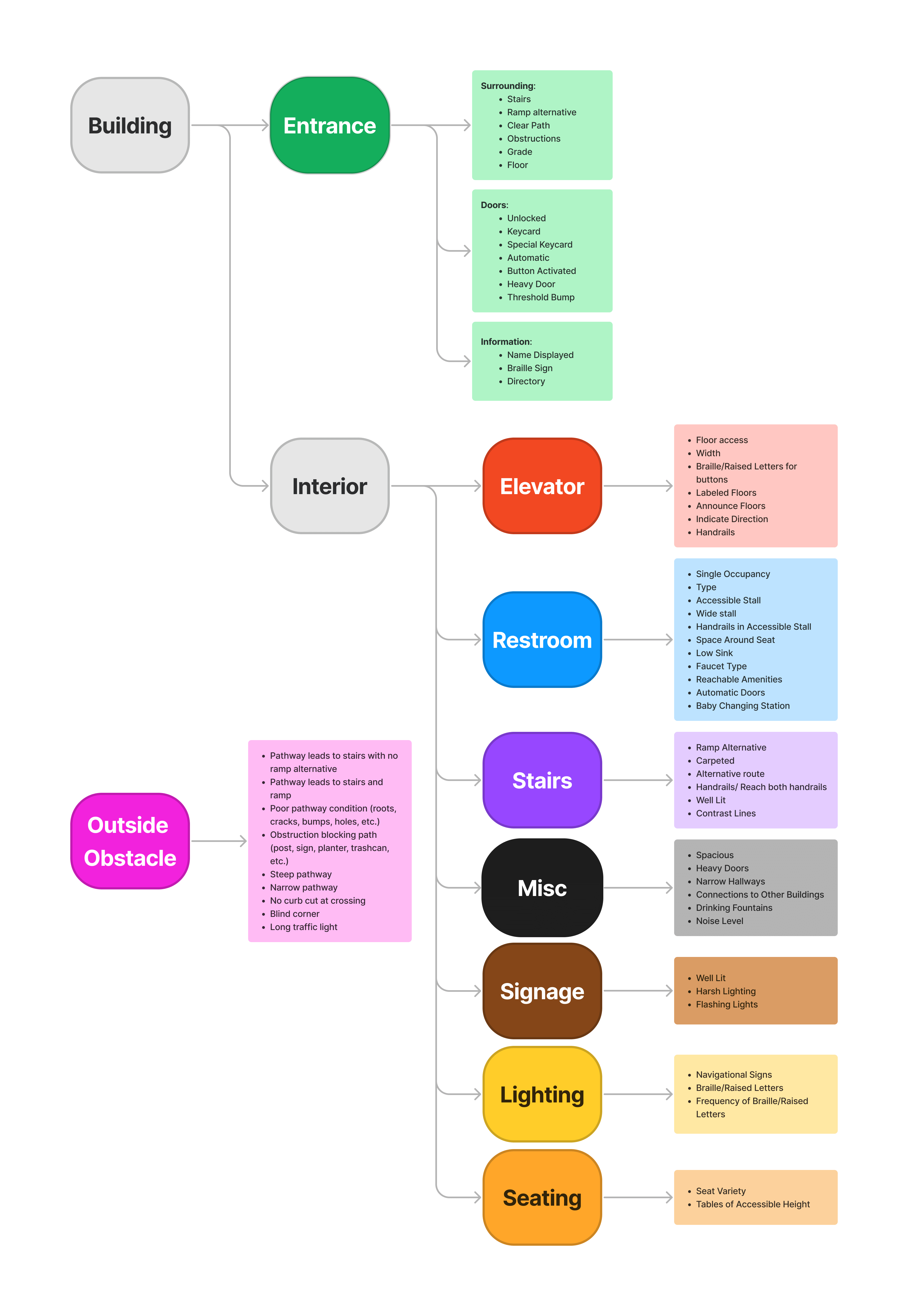
The Develop phase is where I fully dove into ideation and began synthesizing a new, more expansive, and inclusive design. This phase first involved a lot of outlining and sketching. I looked at the type of information I had collected for AM 1.0, broke down information to provide more detail, defined new pieces of information that should be collected going forward, and rearranged information to fit various designs that I sketched out.
I spent much of my time in this phase balancing the depth of information the map would contain and how the design could most practically and intuitively present that information. On top of this, I also created interior navigation functionality that would use the new map information to generate routes through building interiors based on access preferences. I folded all this together in sketches and flowcharts in FigJam, then into a prototype in Figma.
Read More

Greater Granularity
To combat the generality that hindered AM 1.0, I tried tying data to specific features within a building that could be tagged and evaluated during the collection process. To accommodate this data structured as points within the design, I determined that it would be necessary to present information in floor-by-floor breakdowns for each building. But from this, two questions arose: how will the information be laid out in the interface, and what content would have priority? To answer these questions, I played around with various layouts, keeping an eye on the flow of information to strike a balance between presenting too much information at once and burying information too deeply.
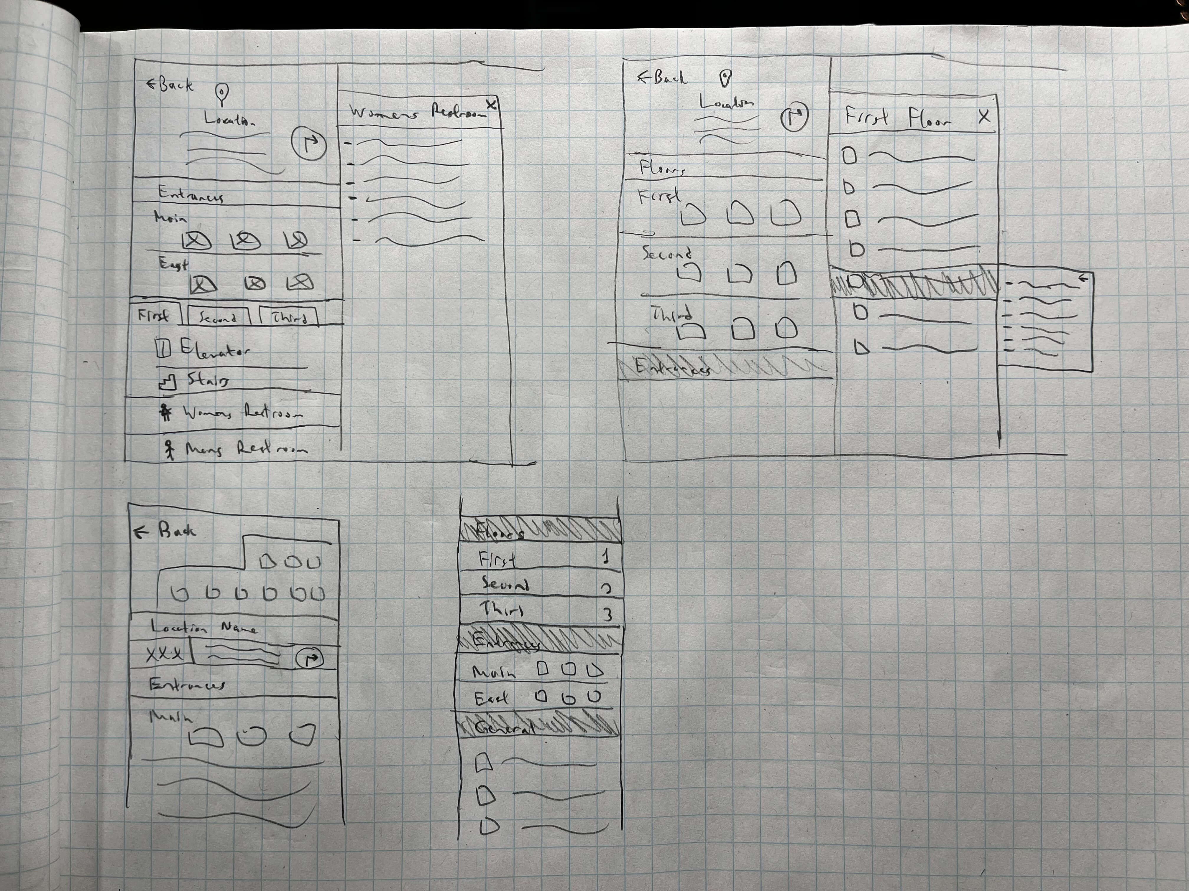
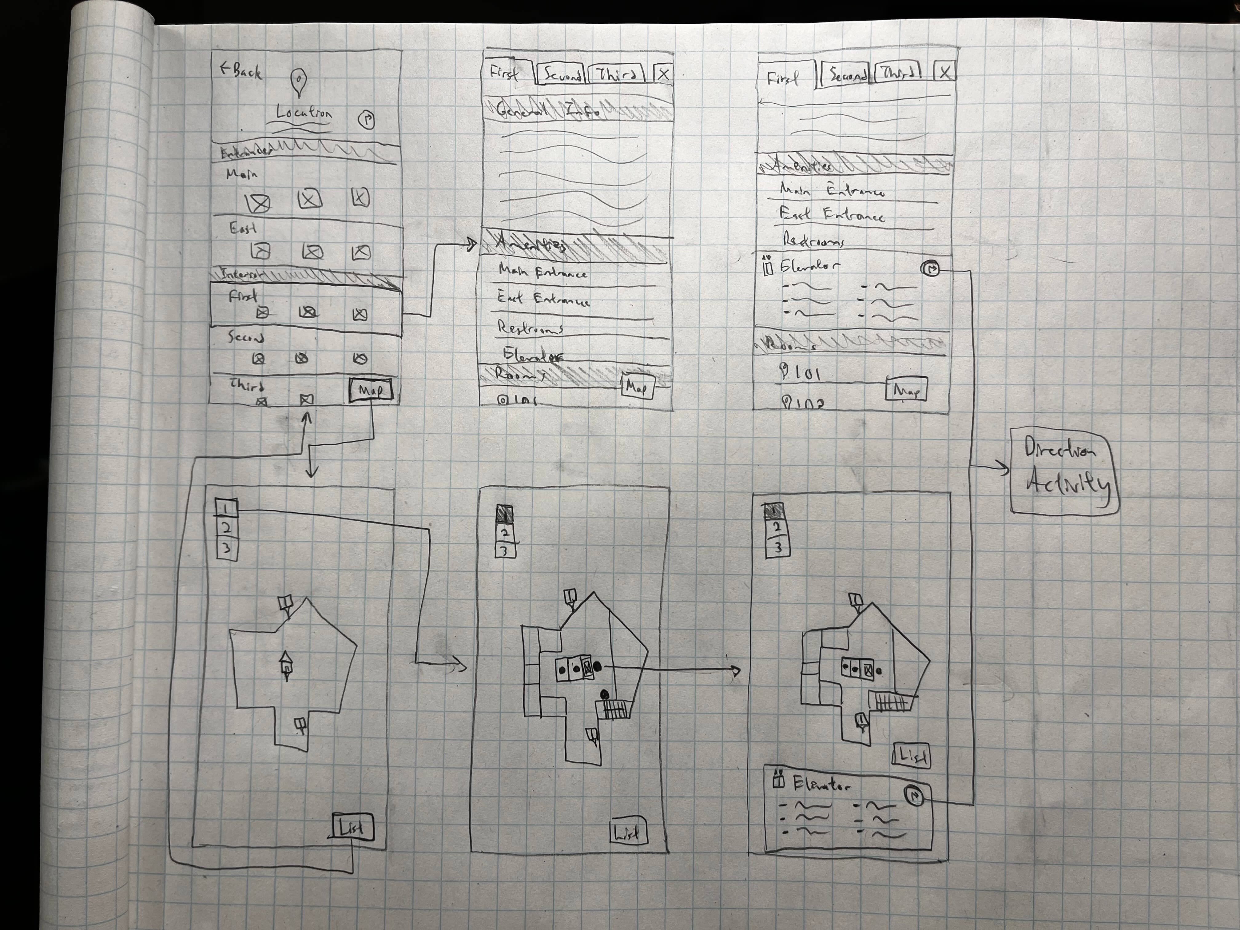
Versatile Design
To make AM 2.0 adhere more to the Principles of Perceptible Information and Flexibility of Use, I determined that a flexible, mobile-first design was necessary. What this meant in this context, first, was a design optimal for on-the-go use—this is a navigational tool, after all, and a navigational tool made for desktop is not going to see much action. And second, a design that could be interacted with in different ways, based on a user's abilities and preferences, to achieve the same goal. To accomplish these, I looked for ways to provide both a visual map experience and a content-based experience while also leaving room for flexibility in the design where possible.
Interior Navigation
To complement my efforts to figure out how to display information in the interface, I took a deep dive into how the data would be structured and queried behind the scenes. Though this is not a standard design task, to create a great product, the backend data structure must work harmoniously with the frontend display of that data.
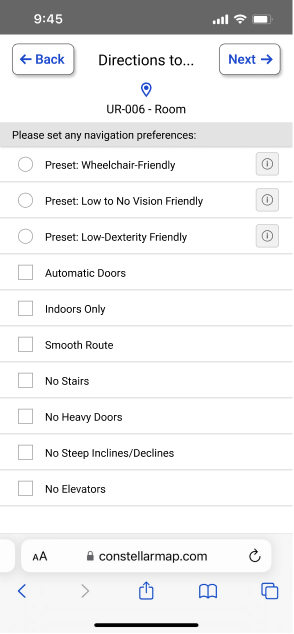
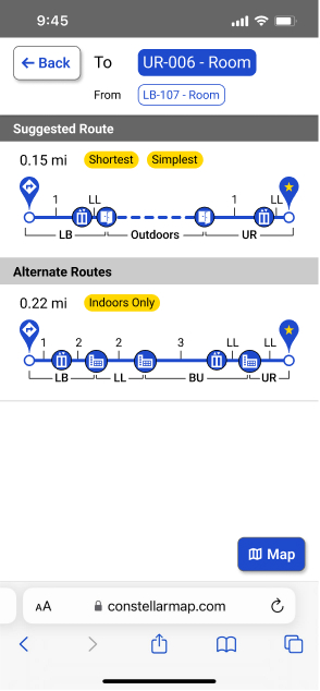
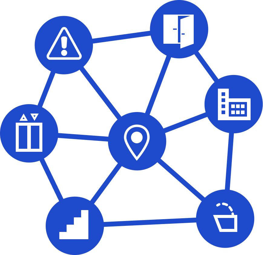
To do this, I first redefined all the evaluation criteria for data collection from single values for each building to repeated values. Thus, for instance, instead of each building having a single set of data for the collective elevators in that building, each building would have data for every elevator. In doing this, every elevator, staircase, water fountain, etc., became a node with a location, type, building, and list of variables associated with it. All this was important to understand, particularly for creating an access-specific direction route feature for the map. With these new nodes, I was able to build a search algorithm that would traverse the data to generate the optimal route between two points, with the option to factor in preferences such as generating routes that prioritize automatic doors and elevators or routes that are completely indoors.
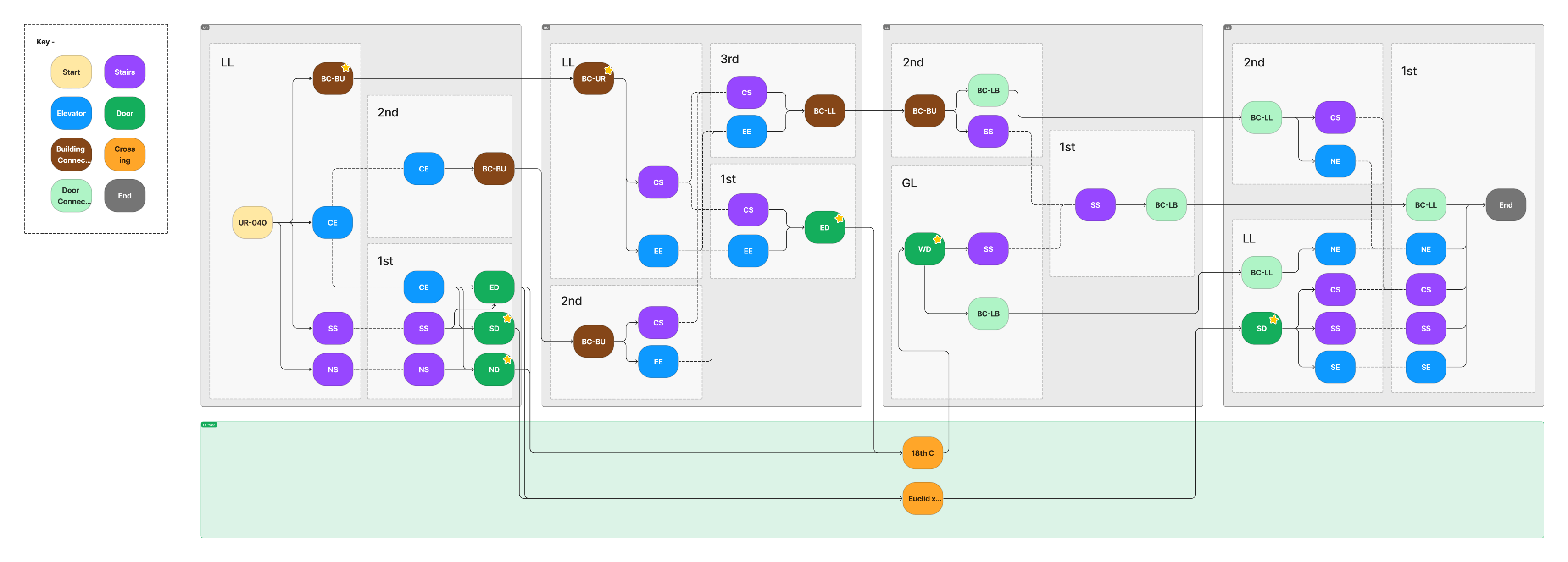
This is a diagram of a node mesh that represents a physical space, which I used for testing search algorithms
Deliver
Product Delivery
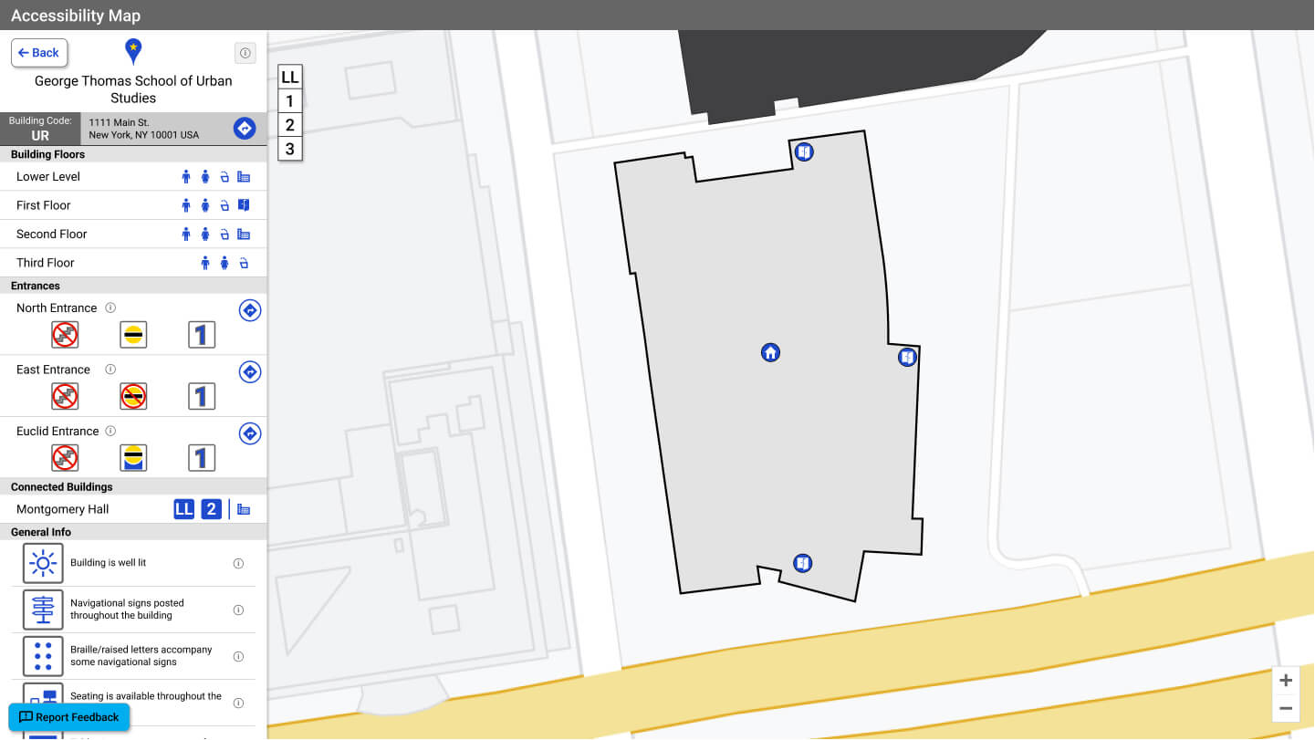
In the final, Deliver phase of the project, my work coalesced into a robust design. Through multiple iterations and fine-tuning, I produced an interactive prototype that hit all the requirements I had set out to accomplish. This is AM 2.0 (shown in desktop view for ease of viewing):
Read More

Interior Breakdown
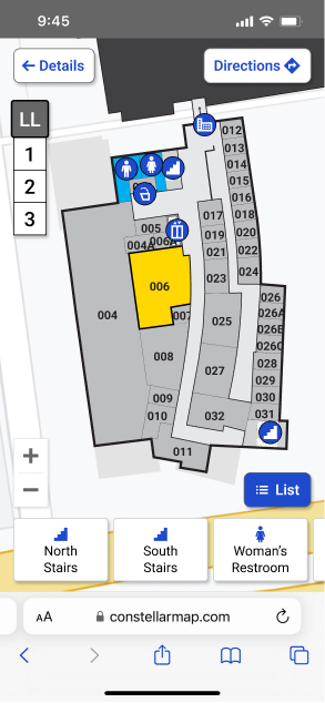
AM 2.0 uses interior floorplans and markers for building features to present more specific information. General building information is still displayed to provide a snapshot of details about the building in the location overview sidebar, but this information is given lower priority. Most information is now collapsed within building features listed on a details panel that slides out from the location overview sidebar. Clicking on a feature from the list expands the feature to show its details. Thus, information is nested, but users can access any information within two clicks.

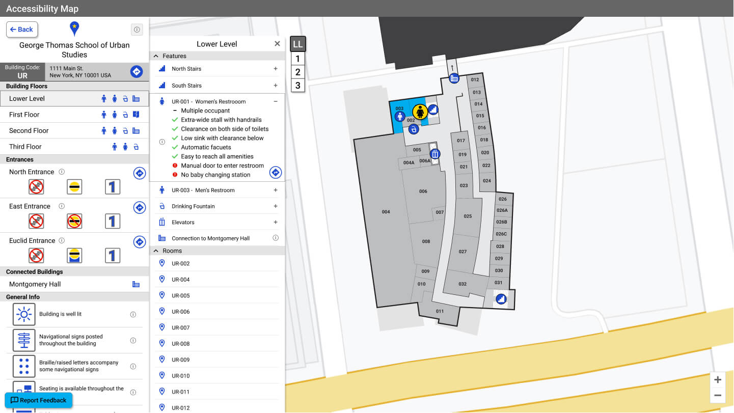
Map View & List View
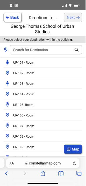
To make AM 2.0 flexible to different abilities and preferences, users can interact with the map entirely from a list view, a map view, or a mix of both. The list view provides an optimal experience for those requiring a screen reader or keyboard access compatibility and those who want to search for buildings or features by name. In contrast, the map view is optimal for anyone who is a more visual and spatial thinker and wants to search for buildings and features by sight. Regardless of the view, both provide an equitable experience that supports the user's navigation.
List View Demo
Map View Demo
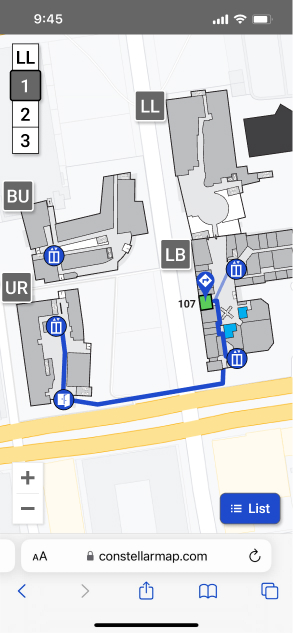
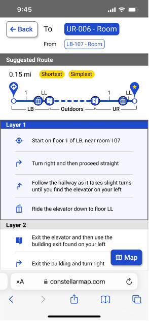
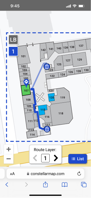
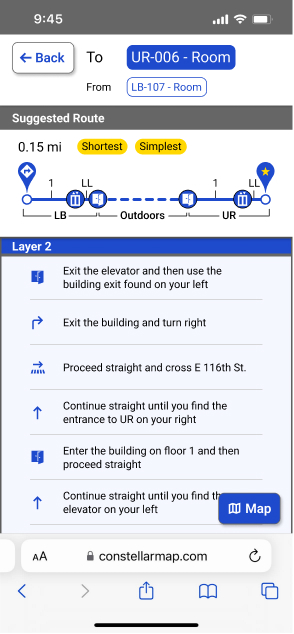
Access Direction Routing
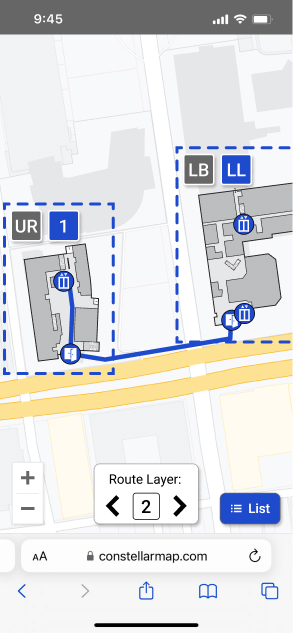
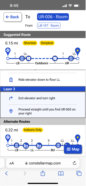
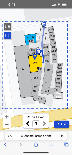
In AM 2.0, users can do more than just view information. They can now also search out specific buildings, rooms, or features, such as restrooms, on the map and receive directions that adhere to preferences they can define.
Conclusion
Development of AM 2.0 is currently underway, with plans to roll it out to additional schools in the coming year, but, even then, work on improving the accessibility map will not be finished. This map is meant to improve and grow continually to help make school campuses more inclusive and accessible. In the coming months, and with each successive map implementation, I will fold new features and improvements into the design based on user feedback.
To date, this is the project I am most proud of. This project has pushed me to grow as a UX Designer and Product Designer by challenging me creatively, technically, and organizationally. I am so happy with how it's turned out thus far, and I'm excited to see how it continues to grow and act as a positive tool for supporting a community

 Home
Home
